ASA Conference on Statistical Practice 2018, Friday 1 of 6, Keynote Address & Working with Messy Data

Some highlights from Conference on Statistical Practice sessions: to keep it simple, just a few notes and my favorite slide per session I attended. I work in Population Health Analytics at Legacy Hospital System in Portland, Oregon, so some of these presenters’ work may be interpreted through that lens.
Posts by time period:
Friday 2/16/2018
- 8:00 AM Keynote Address & 9:15 AM Working with Messy Data
- 11:00 AM Streamlining Your Work Using (Shiny) Apps
- 2:00 PM Data Mining Algorithms / Presenting and Storytelling
- 3:45 PM Working with Health Care Data
- Posters I Wish I’d Seen
- Additional Sessions I Wish I’d Attended
Saturday 2/17/2018
- 9:15 AM Poster Session 3 / Survival Analysis v. ‘Survival’ Analysis
- 11:00 AM Causal Inference
- 2:00 PM Deploying Quantitative Models as ‘Visuals’ in Popular Data Visualization Platforms
- Additional Sessions I Wish I’d Attended
Friday 2/16/2018
8:00 AM Keynote Address
Reflections on Career Opportunities and Leadership in Statistics, Lisa LaVange, The University of North Carolina
Statistical training alone provides perspective and a right to be a leader. She encouraged looking for “statistical leadership” opportunities and I felt inspired by her to improve my leadership artistry.
LaVange described the growing field of precision medicine as determining the right intervention at the right time at the right dose. It struck me that care management is precision medicine, or could become it.
9:15 AM Working with Messy Data
Practical Time-Series Clustering for Messy Data in R Jonathan Robert Page, University of Hawai’i Economic Research Organization
Problem: a Kenyan GoFundMe type site wants to know if there are clusters of projects, in terms of funding patterns, to get a sense which projects need promotion and which do not.
Page took time series data on donations to projects and looked for clusterings using two methods: Dynamic Time Warping (DTW) using dtwclust R package and k-Shapes. He used cumulative sums, not daily donation amounts as the y-value.
After cleaning (for which he presents a wealth of R code), it feels easy (maybe he makes it look easy). DTW seems to cluster on when changes occur so assumes similar jumps in terms of y and measures time distance, the x-distance between the key changes. K-Shapes, meanwhile, seems to measure vertical distance at the same time, but I’m not sure these are correct interpretations.
Page likes to present clusters of Time Series in x by x style - so 4, 9, or 16 clusters. He does this to show stakeholders different resolutions / zoom levels.

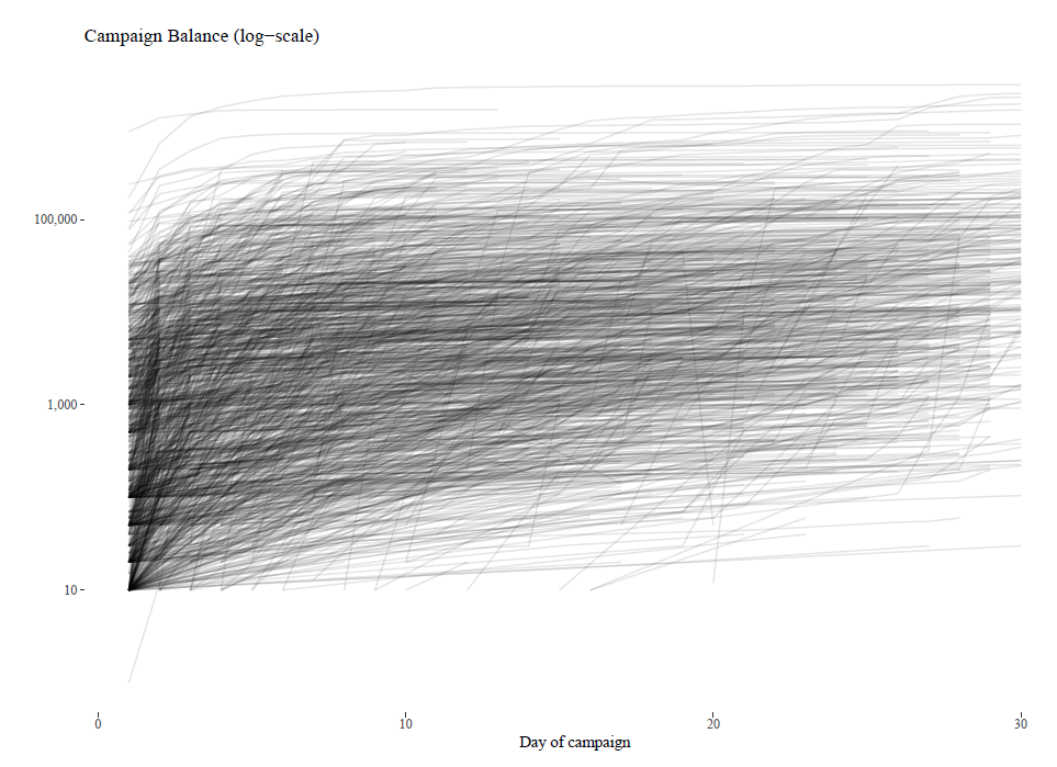
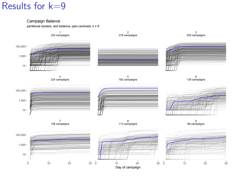
Pretty “smoke graph” I’d call it, with alpha = 0.1. Blue line is medoid of normalized cluster. You can see in the second one a cluster in which no one ever donates anything in the first 30 days. Cluster 5 does great at first then flattens out. Clusters 8 and 9 look the most promising: since they finish their first 30 days still with an upward slope, that may indicate continuing interest.
Doing Data Linkage: A Behind-the-Scenes Look Clinton J. Thompson, National Center for Health Statistics, CDC
Problem: full story of health and death is in two data sets, which require being linked, but these files have millions of rows and no common ID, and thus trillions of possible combinations, so linkage isn’t straightforward. The QC process ultimately takes a long time.
Data linkage processes can be challenging, and it is possible to enhance review and quality control processes. For these two data sets, Thompson links on birth year, sex and first name. Interestingly, first name is a function of birth year and sex, so they eventually decide to aggregate it to just first initial. They found this aggregation method was necessary for working with relatively big data without proper tools to handle it, but that ended up disguising issues at a more granular level.
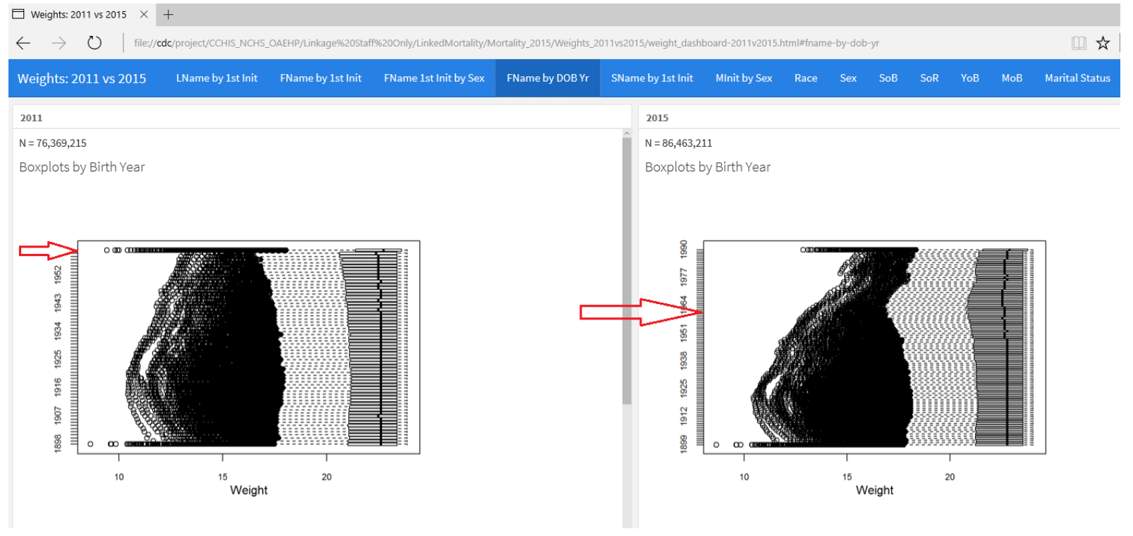
One big change for the most recent run of this linkage in 2015 was to make the upper cutoff of birth year higher at 1990+ instead of 1965+. So everyone who was born after that year in both data sets is in one categorical group. They had to investigate how this affected the quality of the linking, and these sets of box plots with year on the y-axis and weight on the x-axis show how much the distribution changed by this choice of feature engineering. Each point is a different first name. You can see this is one tab “FName by DOB Year” of CDC’s QA data visualization dashboard.

Further comparing 2011 vs. 2015 distributions and summary statistics, Thompson concluded the change was necessary to maintain comparable quality of past data linkages.
He uses dashboards to QC. I see this being a useful way to monitor data for possible errors - a dashboard designed for the analytics team that attempts to answer the question, “Can I trust this new data?” My team could program in checks for the kinds of messes we’ve seen before, and maybe even do processing in PowerBI with check boxes to make suggested corrections. Maybe a top 5 correction suggestions, and check yes to fix it in the output file.