
Clustering NHL Goalies
This has been a great Stanley Cup playoffs for Washington Capitals fans such as myself. With so much breath holding, I’ve paid more attention this year than recent years. As a former goalie myself, my curiosity grew towards: Who are these goalies so much better than me they beat me to being in the NHL? Who’s a hero, and who’s maybe not a keeper?
What better way to understand how they shake out than clustering their regular season statistics? This is an opportunity to work with tibbleColumns by Hoyt Emerson, a new package that adds some intriguing functionality to dplyr, and dendextend by Tal Galili, which adds options to hierarchical clustering diagrams. Best data found came from Rob Vollman at http://www.hockeyabstract.com/testimonials.
Bottom line up front: unsupervised learning here taught more about my data set, and less about the world it represents. Where it did teach about the world of NHL goalies, it showed this guy, is standing out:
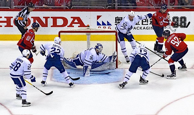
By David from Washington, DC - _25A9839, CC BY 2.0, Link
1. Loading data
How does hockeyabstract’s data look? Let’s load some packages we’ll be using in this analysis and take an initial glimpse.
library(tidyverse)
library(readxl)
library(dbscan)
#devtools::install_github("nhemerson/tibbleColumns") # requires new-ish version of R
library(tibbleColumns)
library(GGally)
library(broom)
library(naniar)
library(ggfortify)
library(RColorBrewer)
library(scales)
library(dendextend)
library(viridis)

goalies <- read_excel('NHL Goalies 2017-18.xls', sheet = 'Goalies')
glimpse(goalies)

#Observations: 95
#Variables: 132
#$ X__1         <dbl> 1, 2, 3, 4, 5, 6, 7, 8, 9, 10, 11, 12, 13, 14, 15, 16, 17, 18, 19, 20, 21, 22, 23, ...
#$ DOB          <dttm> 1998-09-20, 1982-09-18, 1990-03-02, 1988-01-05, 1988-02-11, 1989-09-16, 1988-09-20...
#$ `Birth City` <chr> "Lantzville", "Banská Bystrica", "Barrie", "Norrtälje", "Surrey", "Lloydminster", "...
#$ `S/P`        <chr> "BC", NA, "ON", NA, "BC", "SK", NA, "VA", "ON", "MI", "MA", NA, "MN", "QC", "NB", "...
#$ Cntry        <chr> "CAN", "SVK", "CAN", "SWE", "CAN", "CAN", "RUS", "USA", "CAN", "USA", "USA", "SWE",...
#$ Nat          <chr> "CAN", "SVK", "CAN", "SWE", "CAN", "CAN", "RUS", "USA", "CAN", "USA", "USA", "SWE",...
#$ Ht           <dbl> 73, 73, 75, 76, 74, 74, 74, 78, 78, 75, 74, 78, 73, 74, 73, 76, 75, 74, 76, 73, 73,...
#$ Wt           <dbl> 189, 196, 202, 187, 215, 211, 182, 232, 220, 173, 195, 229, 182, 180, 200, 200, 195...
#$ Sh           <chr> "L", "L", "R", "L", "L", "L", "L", "L", "L", "L", "L", "L", "R", "L", "L", "L", "L"...
At 95 x 132 this has fewer players than variables! Can see the first column is just row number, so remove it. Then take a look look at the distribution of games.
1.1. Distribution of Games Played (GP)
goalies <- goalies[ , -1]

ggplot(goalies, aes(x = GP)) +
  geom_histogram(bins = 10)
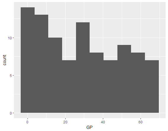
Fairly uniformly distributed with a bit fewer players as the number of games played (GP) goes up.
Defining a starter as a goalie who plays 35+ regular season games in an 82 game regular season, we can see 39 such starters, more than the number of NHL teams, 31. There are some teams with 2 starters. Are they duplicates or shared starters?
goalies %>%
  filter(GP >= 35) %>%
  tbl_out('starters') %>%   # tbl_out saves a data frame and allows a pipe to continue
  count()
## A tibble: 1 x 1
#      n
#  <int>
#1    39

starters %>%
  group_by(`Team(s)`) %>%
  count() %>%
  arrange(desc(n))
## A tibble: 32 x 2
## Groups:   Team(s) [32]
#   `Team(s)`     n
#   <chr>     <int>
# 1 BUF           2
# 2 CAR           2
# 3 COL           2
# 4 DAL           2
# 5 FLA           2
# 6 NJD           2
# 7 WSH           2
# 8 ANA           1
# 9 ARI           1
#10 BOS           1
## ... with 22 more rows

starters %>%
  group_by(`Team(s)`) %>%
  count() %>%
  filter(n == 2) %>%
  ungroup() %>%
  left_join(starters, by = 'Team(s)') %>%
  select(`Team(s)`, `First Name`, `Last Name`)
## A tibble: 14 x 3
#   `Team(s)` `First Name` `Last Name`
#   <chr>     <chr>        <chr>
# 1 BUF       Robin        Lehner
# 2 BUF       Chad         Johnson
# 3 CAR       Scott        Darling
# 4 CAR       Cam          Ward
# 5 COL       Jonathan     Bernier
# 6 COL       Semyon       Varlamov
# 7 DAL       Kari         Lehtonen
# 8 DAL       Ben          Bishop
# 9 FLA       Roberto      Luongo
#10 FLA       James        Reimer
#11 NJD       Keith        Kinkaid
#12 NJD       Cory         Schneider
#13 WSH       Braden       Holtby
#14 WSH       Philipp      Grubauer
## don't see any dupes

# make sure no dupes in general
goalies %>%
  group_by(`Last Name`, `First Name`) %>%
  count() %>%
  filter(n > 1) %>%
  arrange(desc(n))
## A tibble: 0 x 3
# Groups:   Last Name, First Name [0]
# ... with 3 variables: `Last Name` <chr>, `First Name` <chr>, n <int>

goalies %>%
  select(`Last Name`, `First Name`, GP, `Team(s)`) %>%
  filter(str_detect(`Team(s)`, ','))
## A tibble: 6 x 4
#  `Last Name` `First Name`    GP `Team(s)`
#  <chr>       <chr>        <dbl> <chr>
#1 Lack        Eddie            8 CGY, NJD
#2 Kuemper     Darcy           29 LAK, ARI
#3 Montoya     Al              13 MTL, EDM
#4 Domingue    Louis           19 ARI, TBL
#5 Mrazek      Petr            39 DET, PHI
#6 Niemi       Antti           24 PIT, FLA, MTL
So no duplicates. Team(s) can hold more than one team in the field with a comma, as opposed to only showing the last team the goalie played for in 2018. So look like true shared starters.
1.2. Distribution of Heights
Heights of NHL goalies are ridiculous these days! This picture by falsegrit shows Ben Bishop 6’7’’ who currently plays for the Dallas Stars being interviewed by retired NHL goalie Darren Pang 5’5’’.
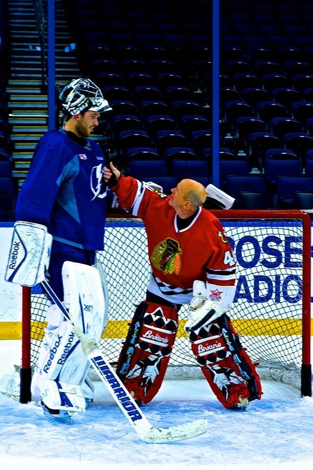
To be fair, Bishop is the tallest NHL netminder ever while Pang is the second shortest. But would Pang be the shortest by a lot today?
goalies %>%
  mutate(`Height in Feet` = Ht / 12) %>%
  ggplot(aes(x = `Height in Feet`, y = GP)) +
  geom_jitter(aes(alpha = .5), width = .01) +
  scale_alpha(guide = FALSE) +
  geom_smooth()
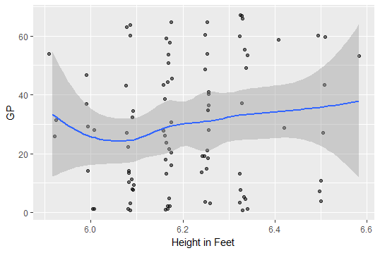
Sorry Darren, less than 6 feet need not apply, it seems.
Who are these new very short netminders on the left getting game time?
goalies %>%
  filter(Ht < 6.0 * 12) %>%
  select(`First Name`, `Last Name`, Ht, GP, `Team(s)`)
## A tibble: 3 x 5
#  `First Name` `Last Name`    Ht    GP `Team(s)`
#  <chr>        <chr>       <dbl> <dbl> <chr>
#1 Juuse        Saros          71    26 NSH
#2 Jaroslav     Halak          71    54 NYI
#3 Anton        Khudobin       71    31 BOS

paste0(71 %/% 12, '\'', 71 %% 12, '\'\', what a bunch of short people!')
# [1] "5'11'', what a bunch of short people!"
5 foot 11 inches. Well, as a bit shorter, now I finally know the primary reason I’m not in the NHL!
2. Initial Clustering
Let’s start with something simple.
2.1. k = 2
Since we’ve looked at Games Played and Height, let’s add another key statistic, Save Percentage and k-means it with k = 2.
clusters_HGS <- goalies %>%
  select(Ht, GP, `SV%`) %>%
  kmeans(centers = 2)
# Error in do_one(nmeth) : NA/NaN/Inf in foreign function call (arg 1)

# we have some NAs
goalies %>%
  select(Ht, GP, `SV%`) %>%
  is.na() %>%
  sum()
#[1] 1

# Just 1, who is it?
goalies[is.na(goalies$Ht), ] %>%
  select(`Last Name`, `First Name`, GP, Ht, `SV%`)
#  `Last Name` `First Name`    GP    Ht `SV%`
#  <chr>       <chr>        <dbl> <dbl> <dbl>
#1 Foster      Scott            1    NA     1
R’s kmeans() returns an error because of an NA. Who is this NA? Scott Foster. Chicago accountant, Scott Foster, may be the most famous NHL goalie after Lester Patrick to play one game. Classy that hockeyabstract added him. Looks like his height is 6’0’’ so we’ll add it.
goalies[is.na(goalies$Ht), 'Ht'] <- 6 * 12
# try again
clusters_HGS <- goalies %>%
select(Ht, GP, `SV%`) %>%
kmeans(centers = 2, nstart = 1000)
goalies$cluster_2 <- factor(clusters_HGS$cluster)
goalies %>%
select(Ht, GP, `SV%`, cluster_2) %>%
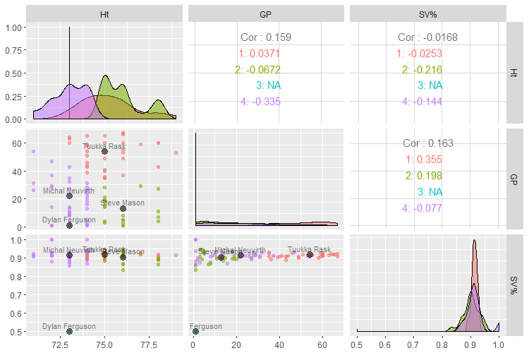
ggpairs(aes(color = cluster_2, alpha = 0.4))
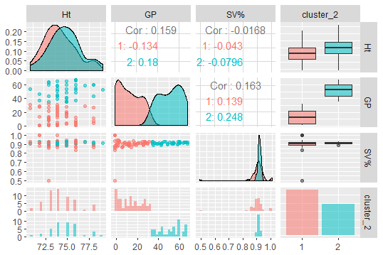
Looking along the diagonal, this clustering splits almost entirely along Games Played. This suggests distinction between backup and starter may be the strongest distinction in these three fields of data. Out of curiosity, what value of GP does that split suggest as a good cutoff for a starter?
goalies %>%
  group_by(cluster_2) %>%
  summarise(min(GP), max(GP))
## A tibble: 2 x 3
#  cluster_2 `min(GP)` `max(GP)`
#  <fct>         <dbl>     <dbl>
#1 1                 1        32
#2 2                35        67
Between 32 GP and 35 GP a goalie becomes a starter - would be a fair rule of thumb for 2017-2018’s NHL regular season.
2.2. Better k than k = 2?
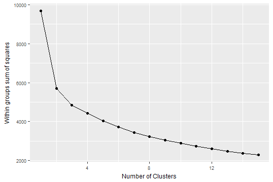
Do these three fields present more than 2 clusters? Using a scree plot to see how much remaining variance additional clusters fail to capture, we see k of 2 and debatably 3 are “elbows” meaning good numbers for these data.
wssplot <- function(df, nc = 15, seed = 1234, nstart = 1){
  wss <- (nrow(df) - 1) * sum(apply(df, 2, var))
  for (i in 2:nc){
    set.seed(seed)
    wss[i] <- sum(kmeans(df, centers = i, nstart = nstart)$withinss)}
  qplot(x = 1:nc, y = wss,  xlab="Number of Clusters",
        ylab="Within groups sum of squares") + geom_line() +
    theme(axis.title.y = element_text(size = rel(.8), angle = 90)) +
    theme(axis.title.x = element_text(size = rel(.8), angle = 00)) +
    theme(axis.text.x = element_text(size = rel(.8))) +
    theme(axis.text.y = element_text(size = rel(.8)))
}

goalies %>%
  select(Ht, GP, `SV%`) %>%
  wssplot(nstart = 1000)
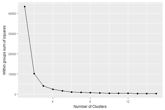
Importantly, though, these data aren’t scaled. Centering and scaling better removes effects of units. For example is a change from 20 to 30 degrees Fahrenheit equal to a change from 20 to 30 degrees Celsius? No! In one case you can still play hockey but in the other it’s too hot. So let’s scale these and retry a scree plot.
# so what if we scale it?
goalies %>%
  select(Ht, GP, `SV%`) %>%
  scale() %>%
  tibble_out('scaled_3_vars') %>%
  wssplot(nstart = 1000)
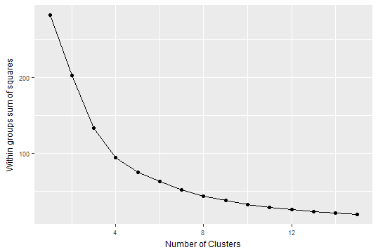
Now it looks like maybe a best bet for an elbow in explaining variance is about k = 4 clusters.
So rerunning the pairs plot with 4 clusters on the scaled variables:
set.seed(1001) # so cluster assignments stay the same
scaled_3_vars %>%
  do(clusters_HGS_scaled = kmeans(., centers = 4, nstart = 1000)) %>%
  tbl_module((.$clusters_HGS_scaled[[1]]$centers), 'scaled_centers') %>%
  do(augment(.$clusters_HGS_scaled[[1]], scaled_3_vars)) %>%
  select('cluster_scaled' = `.cluster`) %>%
  bind_cols(goalies) %>%
  tibble_out('goalies') %>%
  select(Ht, GP, `SV%`, cluster_scaled) %>%
  ggpairs(aes(color = cluster_scaled, alpha = 0.4))
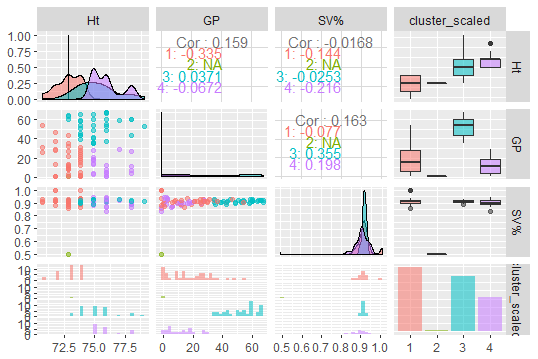
Ht vs GP shows some good separation. Save Percentage (SV%) doesn’t do much except to separate out one “really bad” showing in green, a goalie who had 50% SV%. I’m not saying, as a sub- 5’11’’ individual I could do better, but who is that?
goalies %>%
  filter(cluster_scaled == 3) %>%
  select(`First Name`, `Last Name`, GP, Ht, `SV%`, cluster_scaled, SA, MIN)
## A tibble: 1 x 8
#  `First Name` `Last Name`    GP    Ht `SV%` cluster_scaled    SA   MIN
#  <chr>        <chr>       <dbl> <dbl> <dbl> <fct>          <dbl> <dbl>
#1 Dylan        Ferguson        1    73   0.5 3                  2   554
Dylan Ferguson apparently had 2 shots against (SA) in 554 minutes. Either amazing defense, or units are actually in seconds not minutes. Wikipedia verifies he played a little over 9 minutes, or 554 / 60. Will let hockeyabstract know! Let’s fix it, anyway.
goalies <- mutate(goalies, MIN = MIN / 60)
2.3. Prototypical Members
Who are the prototypical members of the cluster? That is, who is closest to the centroid? Algorithmically: for each center, for each player, we need to calculate total Euclidean distance to each center then return the player with the lowest distance to each center.
vars <- colnames(scaled_3_vars)
distances <- map(1:4, ~ rowSums(abs(scaled_3_vars[ , vars] -
      as.data.frame(t(scaled_centers[.x, vars]))
       [rep(1, each = nrow(scaled_3_vars)),] )))
# this gives you 4 lists, 1 per cluster
# for each cluster of distances, which player is the min?
prototype_player_nums <- map(1:4, ~ which.min(distances[[.x]]))

# for each prototype, who is it?
prototypes <- map_df(1:4, ~ goalies[prototype_player_nums[[.x]],
  c('cluster_scaled', 'First Name', 'Last Name', vars, 'Team(s)')])


# and now plot them on the ggpairs to understand
pm <- goalies %>%
  select(Ht, GP, `SV%`, cluster_scaled) %>%
  ggpairs(aes(color = cluster_scaled, alpha = 0.4),
          columns = vars)

# which plots to add points?
sps <- list(pm[2,1], pm[3,1], pm[3,2])
sps2 <- map(1:length(sps), ~ sps[[.x]] + geom_point(data = prototypes, size = 3,
  color = 1, alpha = .5) + geom_text(data = prototypes, aes(label =
  paste0(`First Name`, " ", `Last Name`)), color = 1, vjust = -0.5, size = 3,
  alpha = .5))
pm[2,1] <- sps2[[1]]
pm[3,1] <- sps2[[2]]
pm[3,2] <- sps2[[3]]
pm
What do these four clusters teach us about these data? Looking at the scatterplot with the best separation, row 2, column 1, Ht vs. GP, we can see the red group in the top-right corner of the plot, represented by Tukka Rask, is taller than average and mostly starters. Backups, in the lower half of the plot can be “short” (purple) or tall (green). Then there’s the 50% save percentage group, which we already know about. Sorry, Ferguson.
3. Clustering on All Data
OK let’s add in all the data we can quickly get somewhere with.
3.1. How Many Clusters?
Ignoring categorical data for now, how many columns are numeric?
goalies %>%
  map_lgl(is.numeric) %>%
  mean()
#[1] 0.8120301
81% of columns are numeric. Let’s save just those.
goalies[, map_lgl(goalies, is.numeric)] %>%
  tibble_out('goalies_stats') %>%
  glimpse()
#Observations: 95
Variables: 108
$ Ht          <dbl> 73, 73, 75, 76, 74, 74, 74, 78, 78, 75, 74, 78, 73, 74, 73, 76, 75, 7...
#$ Wt          <dbl> 189, 196, 202, 187, 215, 211, 182, 232, 220, 173, 195, 229, 182, 180,...
#$ `Dft Yr`    <dbl> 2017, 2001, 2008, NA, NA, 2008, NA, 2007, NA, 1999, NA, 2009, NA, 200...
#...
#$ MIN__1      <dbl> 9, 20144, 5414, 7996, 3092, 20678, 22814, 6557, 1092, 42926, 7073, 57...
#$ QS__2       <dbl> 0, 117, 41, 62, 33, 211, 229, 54, 6, 338, 56, 38, 12, 319, 38, 134, 4...
#$ RBS__1      <dbl> 0, 41, 12, 22, 5, 45, 46, 13, 8, 72, 22, 16, 5, 78, 13, 27, 13, 7, 26...
#$ GPS__1      <dbl> -0.1, 50.7, 14.3, 20.5, 10.8, 68.2, 77.7, 17.9, 1.1, 143.4, 17.4, 15....
These last 13 columns are all career stats. They all have a double underscore, __ because they have duplicate names of other fields. They make veteran Henrik Lundqvist look the best if included in this year’s numbers. Honestly, didn’t even see this until trying to figure out why he looked the best in these numbers but not in any 2017-2018 stats posted at nhl.com.
We could leave them in for some questions, but since ours are limited to 2017-2018 regular season performance, results are more interpretable if we take these 13 columns out.
goalies_stats[ , c((108-12):108)]
## A tibble: 95 x 13
#   GP__1 GS__1  W__1  L__1 OTL__1 GA__2 SA__2 SO__1 PIM__1 MIN__1 QS__2 RBS__1 GPS__1
#   <dbl> <dbl> <dbl> <dbl>  <dbl> <dbl> <dbl> <dbl>  <dbl>  <dbl> <dbl>  <dbl>  <dbl>
# 1     1     0     0     0      0     1     2     0      0      9     0      0   -0.1
# 2   365   246   158   131     40   903  9418    18     20  20144   117     41   50.7
# 3   102    87    43    39     11   239  2644     3      0   5414    41     12   14.3
# 4   144   126    56    55     18   349  3832     9      2   7996    62     22   20.5
# 5    56    49    27    15      6   119  1549     4      2   3092    33      5   10.8
# 6   361   353   225    89     35   831 10306    32     19  20678   211     45   68.2
# 7   395   385   218   129     36   929 11607    24     18  22814   229     46   77.7
# 8   118   104    52    38     16   292  3251     4      2   6557    54     13   17.9
# 9    21    21     5     9      4    68   565     2      0   1092     6      8    1.1
#10   737   593   370   268     80  1863 21999    43     48  42926   338     72  143.
## ... with 85 more rows

goalies_stats <- goalies_stats[ , -c((108-12):108)]
This leaves 95 numeric columns. Can we answer how many clusters there are in these 95 variables?
goalies_stats %>%
  scale() %>%
  tibble_out('scaled_all_vars') %>%
  wssplot(nstart = 1000)
# Error in do_one(nmeth) : NA/NaN/Inf in foreign function call (arg 1)
We have more NAs. Let’s take a look at missingness.
vis_miss(goalies_stats)
It looks like only a handful of variables have issues. Which are they?
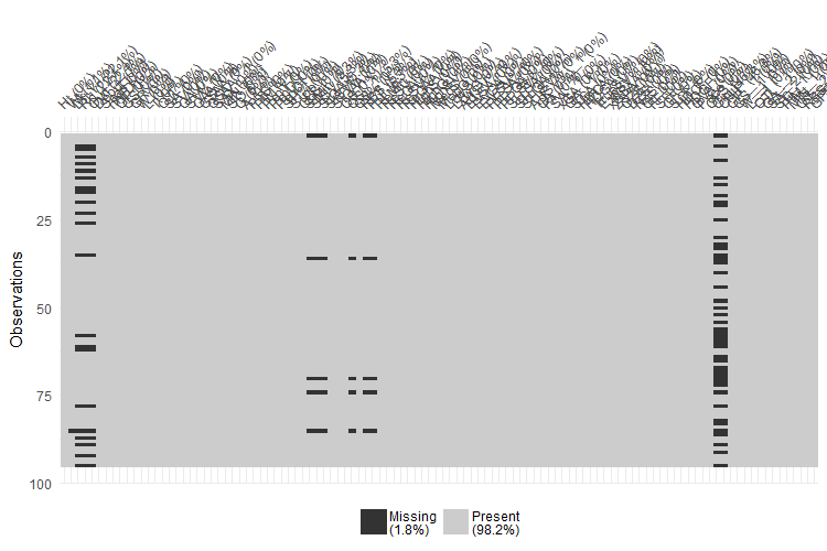
sort(unlist(lapply(goalies_stats, function(x) sum(is.na(x)))))
#     SO__1    PIM__1    MIN__1     QS__2    RBS__1    GPS__1        Wt     StMin      StSV
#        0         0         0         0         0         0         1         5         5
#     StGA     QS__1       RBS      Pull    Dft Yr        Rd      Ovrl      Ginj      CHIP
#        5         5         5         5        21        21        21        44        44
>
Looks like CHIP (Cap Hit of Injured Player) and Ginj (Games Injured), as well as three Draft variables. Are those players who haven’t had an injury or been drafted?
table(goalies_stats$Ginj)
#
# 1  2  3  4  5  6  8  9 11 12 13 14 15 31 32 36
# 6  4  1 26  2  1  1  1  1  1  2  1  1  1  1  1

table(goalies_stats$CHIP)
#
#  7  11  18  21  45  51  61  88  91 110 171 195 207 265 282 285 299 305 317 400 469 483 545
#  1   1   1   1   1   1   1   1   1   1   1  26   1   1   1   1   1   1   1   1   1   1   1
#551 735 988
#  1   1   1

goalies_stats$Ginj[is.na(goalies_stats$Ginj)] <- 0
goalies_stats$CHIP[is.na(goalies_stats$CHIP)] <- 0
There are no zeros. So going to assume NA implies 0 on these injury variables.
What do we do about draft stats? We could MICE them, but I’m OK with dropping them to get somewhere with what we have more quickly.
goalies_stats <- goalies_stats[ , -which(names(goalies_stats) %in% c('Dft Yr', 'Rd', 'Ovrl'))]
Next, at 5, was PULL. Who are the NAs for PULL?
goalies_stats %>%
  filter(is.na(Pull)) %>%
  select(GP)
## A tibble: 5 x 1
#     GP
#  <dbl>
#1     1
#2     1
#3     1
#4     1
#5     1

goalies_stats$Pull[is.na(goalies_stats$Pull)] <- 0
They all played one game. So we’ll set NA as 0 pulls.
RBS (Really Bad Starts, stopped less than 85% of shots) NAs also correspond to 1 gamers, so probably safe to set NAs as 0.
goalies_stats %>%
  filter(is.na(RBS)) %>%
  select(GP)
## A tibble: 5 x 1
#     GP
#  <dbl>
#1     1
#2     1
#3     1
#4     1
#5     1

goalies_stats$RBS[is.na(goalies_stats$RBS)] <- 0
Who’s missing on Wt?
goalies %>%
  filter(is.na(Wt)) %>%
  select(`First Name`, `Last Name`)
## A tibble: 1 x 2
#  `First Name` `Last Name`
#  <chr>        <chr>
#1 Scott        Foster

goalies_stats$Wt[is.na(goalies_stats$Wt)] <- 185
Scott Foster’s weight is also on Wikipedia. (May be the only accountant whose weight is on Wikipedia.)
All the remaining NAs correspond to one-game-players, so setting them as 0s then hopefully ready to retry the screeplot.
goalies_stats <- goalies_stats %>%
  mutate_all(funs(replace(., is.na(.), 0)))

sum(is.na(goalies_stats))
#[1] 0

goalies_stats %>%
  scale() %>%
  tibble_out('scaled_all_vars') %>%
  wssplot(nstart = 1000)
# Error in do_one(nmeth) : NA/NaN/Inf in foreign function call (arg 1)

sum(is.na(scaled_all_vars)) # more NAs!
#[1] 190

vis_miss(scaled_all_vars)
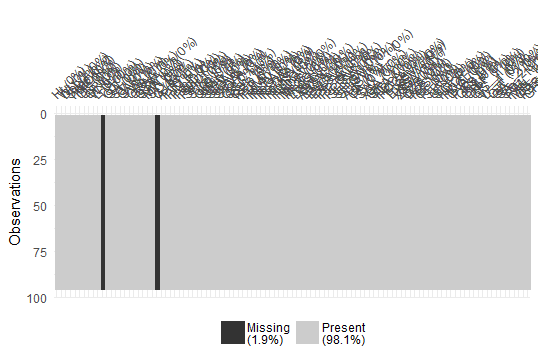
Scaling introduced new NAs, all in two variables:
sort(unlist(lapply(scaled_all_vars, function(x) sum(is.na(x)))))
#   MIN__1     QS__2    RBS__1    GPS__1         T         G
#        0         0         0         0        95        95
G is goals. No goalies scored this year, so no variation, so can remove it for clustering purposes. And T?
table(goalies$T)
#
# 0
#95
I don’t know what it is, it’s not in the legend, so removing it.
scaled_all_vars <- scaled_all_vars[ , -which(names(scaled_all_vars) %in% c('G', 'T'))]

# Verify variance is uniform
plot(sapply(scaled_all_vars, var))
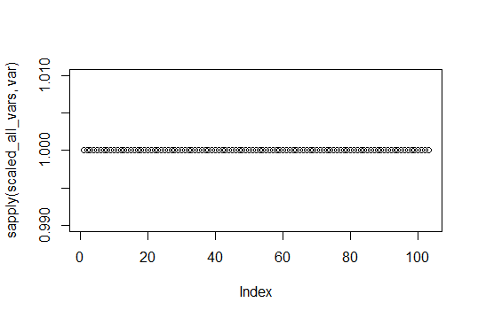
Can see here scaling has made all variances 1 for all variables, so ready to do scaled clustering.
scaled_all_vars %>%
  wssplot(nstart = 1000)
An elbow exists at 2 clusters but with so many variables, we would probably want to do the less ideal thing and go further out to get at more variation explained. Enter PCA.
3.2. Principal Component Analysis (PCA)
Another way to simplify this problem is to use principal components to remake the many variables into a smaller subset of linear combinations of variables. If going to use principal components, how many PCs do we want?
pc <- princomp(scaled_all_vars)
#Error in princomp.default(scaled_all_vars) :
#  'princomp' can only be used with more units than variables
## oh darn, there is one that can do it
set.seed(1001)
pc <- prcomp(scaled_all_vars)

plot(pc)
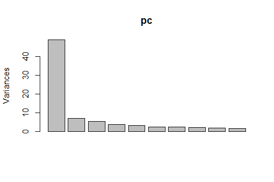
Surprisingly most of the variation in these fields is in the first principal component, as greater than 50% on the y-axis. Visualizing PC1 and PC2, the two biggest variance explainers,
autoplot(prcomp(scaled_all_vars), data = scaled_all_vars,
         loadings = TRUE, loadings.colour = 'blue',
         loadings.label = TRUE, loadings.label.size = 3)
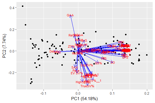
It’s obvious from the concentration of red to the mid-right, a ton of really highly correlated variables are driving PC1. Investigating the top variables in PC1 using rotation shows it makes sense they’re correlated:
sort(pc$rotation[ ,1], decreasing = TRUE)
#       SA__1           SA           SV           FA           CA          MIN           GP
# 0.142728794  0.142728788  0.142726126  0.142714667  0.142702020  0.142672217  0.142547040
#        EVSA           GS         StSV        StMin          NZS          DZS           SF
# 0.142513313  0.142511016  0.142508544  0.142470665  0.142383971  0.142200082  0.142139325
#          FF          xGA           CF         MedS         LowS          OZS          SCF
# 0.142106928  0.142056602  0.141968951  0.141909153  0.141793721  0.141634706  0.141467662
#         SCA         HDCA         HDCF        HighS         StGA           GA        GA__1
# 0.141419406  0.141419406  0.141086612  0.140628788  0.140348953  0.140170882  0.140170882
These are factors like Shots Against, Saves, Faced Shot Attempts, Minutes, GP, and all the variations on those like even strength shots against. Basically there is less variation among goalies in these statistics than the number of variables might suggest at first glance. This implies our intuition of what separates these goalies at finer distinctions may be found in higher principal components. That also suggests exploring hierarchical clustering analysis.
We can get to 85% variation explained reducing these 90 variables to 10 principal components so we’ll use 10.
summary(pc)

#Importance of components:
#                          PC1     PC2     PC3     PC4     PC5     PC6     PC7     PC8     PC9
#Standard deviation     6.9832 2.63913 2.32673 1.90361 1.77209 1.56917 1.50376 1.41169 1.33081
#Proportion of Variance 0.5418 0.07739 0.06015 0.04026 0.03489 0.02736 0.02513 0.02214 0.01968
#Cumulative Proportion  0.5418 0.61922 0.67937 0.71964 0.75453 0.78189 0.80702 0.82916 0.84884
#                          PC10    PC11    PC12    PC13    PC14    PC15    PC16    PC17
#Standard deviation     1.20347 1.16535 1.12200 1.05477 0.93345 0.88962 0.80952 0.76194
#Proportion of Variance 0.01609 0.01509 0.01399 0.01236 0.00968 0.00879 0.00728 0.00645
#Cumulative Proportion  0.86493 0.88002 0.89401 0.90637 0.91605 0.92484 0.93212 0.93857

comp <- data.frame(pc$x[,1:10])
set.seed(1001)
k <- comp %>%
  kmeans(4, nstart = 10000, iter.max = 1000)
palette(alpha(brewer.pal(9,'Set1'), 0.5))
plot(comp, col=k$clust, pch=16)
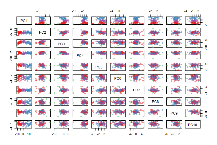
Trying to look at all 10 PCs at once, can see some good separation at the top-left scatter plots, and much more mixing as we move towards the bottom and right. Since we have built some intuition for k = 4 clusters, this plot has four clustered colors as a comparison to make sense of this more complex situation. Let’s say we have four groups, who are the prototypes?
goalies$pca_cluster_4 <- factor(k$cluster)
goalies <- goalies %>%
  bind_cols(comp)

vars <- colnames(comp)
distances <- map(1:4, ~ rowSums(abs(comp[ , vars] -
                    as.data.frame(t(k$centers[.x, vars]))
                    [rep(1, each = nrow(comp)),] )))
# this gives you 4 lists, 1 per cluster
# for each cluster of distances, which player is the min?
prototype_player_nums <- map(1:4, ~ which.min(distances[[.x]]))
# for each prototype, who is it?
prototypes <- map_df(1:4, ~ goalies[prototype_player_nums[[.x]], c('pca_cluster_4', 'First Name', 'Last Name', 'Team(s)', vars)])

prototypes
## A tibble: 4 x 14
#  pca_cluster_4 `First Name` `Last Name` `Team(s)`     PC1     PC2    PC3     PC4     PC5
#  <fct>         <chr>        <chr>       <chr>       <dbl>   <dbl>  <dbl>   <dbl>   <dbl>
#1 1             Alexandar    Georgiev    NYR        -6.05   -1.36  -0.303   0.973 -0.132
#2 2             Tuukka       Rask        BOS         8.09   -0.768 -1.05   -0.449  0.698
#3 3             Dylan        Ferguson    VGK       -11.0    10.7   -9.70  -10.8    0.0825
#4 4             Anton        Forsberg    CHI         0.653   0.324  1.33   -0.611 -0.201
## ... with 5 more variables: PC6 <dbl>, PC7 <dbl>, PC8 <dbl>, PC9 <dbl>, PC10 <dbl>
Tuukka Rask and Dylan Ferguson made it in this list from earlier prototyping with fewer variables, again. Let’s plot just 4 of the 10 PCs to be a bit more digestible.
pm <- goalies %>%
  select(vars, pca_cluster_4) %>%
  ggpairs(aes(color = pca_cluster_4, alpha = 0.4),
          columns = vars[1:4])

sps <- list(pm[2,1], pm[3,1], pm[4,1], pm[3,2], pm[4,2], pm[4,3])
sps2 <- map(1:length(sps), ~ sps[[.x]] + geom_point(data = prototypes, size = 3, color = 'black', alpha = .5) + geom_text(data = prototypes, aes(label = paste0(`First Name`, " ", `Last Name`)), color = 'black', vjust = -0.5, size = 3, alpha = .5))
pm[2,1] <- sps2[[1]]
pm[3,1] <- sps2[[2]]
pm[4,1] <- sps2[[3]]
pm[3,2] <- sps2[[4]]
pm[4,2] <- sps2[[5]]
pm[4,3] <- sps2[[6]]
pm
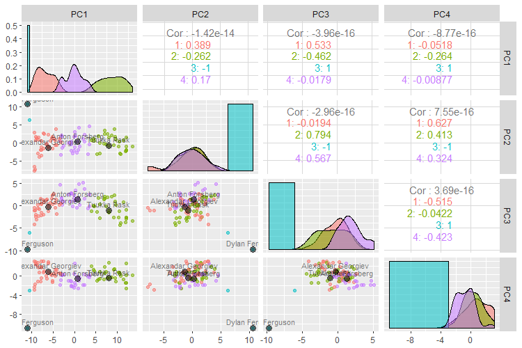
So what’s it picking up?
- (red) Alexandar Georgiev, at 10 games and .918 SV% is a strong-performing backup, but didn’t play much.
- (green) Tukka Rask this year was a starting goalie with a good save percentage at .917.
- (blue) Dylan Ferguson we know from before as the 9:14 min, two shots, one goal.
- (purple) Anton Forsberg, at 35 games is borderline starter, basically sharing duties. His save percentage is a bit lower at .908.
This begins to tell a story about about these 90 numeric variables in our data set. It tells us most of their variation is around a ton of highly correlated variables. This makes sense - in general, the better you play, the more games you play, more shots you face, more saves, more 5v5 shots, more face offs, etc.
Basically these clusterings are telling us something about the limitation of questions these data can answer without further feature engineering and additional variables. Most variation is around games played and a bit around success of performance in those games played. Everyone is tall, and granularity is only at the inch level, so it seems height isn’t the biggest area of variation.
Is there any new knowledge discoverable in this data set? One particularly relevant question is who stands out in their group?
4. Outliers
So one thing we can do to build on this work is look for outliers.
4.1. Highest PC1
As higher PC1s tend to represent higher performing goalies in this clustering of 2017-2018’s regular season, who has the highest PC1?
goalies %>%
  arrange(desc(PC1)) %>%
  select(PC1, 'First Name', 'Last Name', 'Team(s)')
## A tibble: 95 x 4
#     PC1 `First Name` `Last Name` `Team(s)`
#   <dbl> <chr>        <chr>       <chr>
# 1  13.5 Frederik     Andersen    TOR
# 2  12.1 Jonathan     Quick       LAK
# 3  12.1 Andrei       Vasilevskiy TBL
# 4  12.0 Connor       Hellebuyck  WPG
# 5  12.0 Cam          Talbot      EDM
# 6  12.0 Sergei       Bobrovsky   CBJ
# 7  11.4 Henrik       Lundqvist   NYR
# 8  10.9 Pekka        Rinne       NSH
# 9  10.6 John         Gibson      ANA
#10  10.5 Devan        Dubnyk      MIN
## ... with 85 more rows
Does that make Frederik Andersen the favorite for the Vezina? His stats don’t seem that outstanding but he did play a lot of games. Would be good to see why he has the best PC1.
which(goalies$`Last Name` == 'Andersen')
#[1] 55

vars <- names(pc$rotation[ , 1])
Andersen_PC1 <- pc$rotation[vars, 1] * scaled_all_vars[55, vars] %>%
  t()
sum(Andersen_PC1) # matches
#[1] 13.53428

data_frame("Variable" = rownames(Andersen_PC1),
           "Value" = Andersen_PC1[,1]) %>%
  arrange(desc(abs(Value)))
## A tibble: 90 x 2
#   Variable Value
#   <chr>    <dbl>
# 1 SCF      0.335
# 2 HDGF     0.333
# 3 HDCF     0.331
# 4 xGA      0.314
# 5 HighG    0.310
# 6 EVSA     0.310
# 7 HighS    0.310
# 8 DZS      0.308
# 9 GVA      0.306
#10 StSV     0.304
## ... with 80 more rows
- SCF = Toronto’s scoring chances
- HDGF = Toronto goals
- HDCF = Toronto goals
- xGA = Expected Goals Against (?)
- HighG = Goals allowed
Actually these are neutral or negative even. Toronto had a lot of shots against, yet still made the playoffs. But I wouldn’t say Andersen’s the front runner for the Vezina. If we want to know that, it may make more sense to fit a predictive model on previous winners or nominees. But something very different was happening in his case. It’s not quite clear what, but he’s an extreme case.
The Leafs had a record year for the franchise on some stats, so could be picking that up. On nhl.com, I can see he did face the most shots this season and made the most saves. Perhaps this means if he was on a better team, he would be the front runner for the Vezina?
4.2. Unusual GPs by Group
Who doesn’t quite belong in their group?
goalies %>%
  group_by(pca_cluster_4) %>%
  top_n(2, GP) %>%
  arrange(desc(PC1)) %>%
  select('pca_cluster_4', 'First Name', 'Last Name', 'Team(s)', 'GP', 'SV%', PC1, DOB) %>%
  tibble_out('up_and_up')
## A tibble: 8 x 8
## Groups:   pca_cluster_4 [4]
#  pca_cluster_4 `First Name` `Last Name` `Team(s)`    GP `SV%`    PC1 DOB
#  <fct>         <chr>        <chr>       <chr>     <dbl> <dbl>  <dbl> <dttm>
#1 2             Connor       Hellebuyck  WPG          67 0.924  12.0  1993-05-19 00:00:00
#2 2             Cam          Talbot      EDM          67 0.908  12.0  1987-07-05 00:00:00
#3 4             Keith        Kinkaid     NJD          41 0.913   3.57 1989-07-04 00:00:00
#4 4             Scott        Darling     CAR          43 0.888   3.47 1988-12-22 00:00:00
#5 1             David        Rittich     CGY          21 0.904  -3.20 1992-08-19 00:00:00
#6 1             Joonas       Korpisalo   CBJ          18 0.897  -3.57 1994-04-28 00:00:00
#7 3             Brandon      Halverson   NYR           1 0.833 -10.4  1996-03-29 00:00:00
#8 3             Dylan        Ferguson    VGK           1 0.5   -11.0  1998-09-20 00:00:00
## I think this means these are goalies we might see more of

goalies %>%
  group_by(pca_cluster_4) %>%
  top_n(2, desc(GP)) %>%
  arrange(desc(PC1)) %>%
  select('pca_cluster_4', 'First Name', 'Last Name', 'Team(s)', 'GP', 'SV%', PC1, DOB) %>%
  filter(pca_cluster_4 != 1)%>%
  tibble_out('down_and_down')
## A tibble: 8 x 8
## Groups:   pca_cluster_4 [3]
#  pca_cluster_4 `First Name` `Last Name` `Team(s)`    GP `SV%`    PC1 DOB
#  <fct>         <chr>        <chr>       <chr>     <dbl> <dbl>  <dbl> <dttm>
#1 2             Brian        Elliott     PHI          43 0.909   4.56 1985-04-09 00:00:00
#2 2             Cam          Ward        CAR          43 0.906   4.38 1984-02-29 00:00:00
#3 2             Cory         Schneider   NJD          40 0.907   4.00 1986-03-18 00:00:00
#4 4             Louis        Domingue    ARI, TBL     19 0.894  -3.08 1992-03-06 00:00:00
#5 4             Curtis       McElhinney  TOR          18 0.934  -3.19 1983-05-23 00:00:00
#6 4             Ondrej       Pavelec     NYR          19 0.910  -3.29 1987-08-31 00:00:00
#7 3             Brandon      Halverson   NYR           1 0.833 -10.4  1996-03-29 00:00:00
#8 3             Dylan        Ferguson    VGK           1 0.5   -11.0  1998-09-20 00:00:00
# I think this means these are goalies we might see less of

goalies %>%
  ggplot(aes(x = `GP`, y = `SV%`, color = pca_cluster_4)) +
  geom_point() +
  scale_y_continuous(limits = c(0.85, 0.95)) +
  scale_x_continuous(limits = c(0, 68)) +
  geom_text(data = up_and_up, aes(label = paste0(`First Name`, " ", `Last Name`)),
    color = 'darkgreen', vjust = -0.5, size = 3, alpha = .5) +
  geom_text(data = down_and_down, aes(label = paste0(`First Name`, " ", `Last Name`)),
    color = 'darkred', vjust = -0.5, size = 3, alpha = .5)
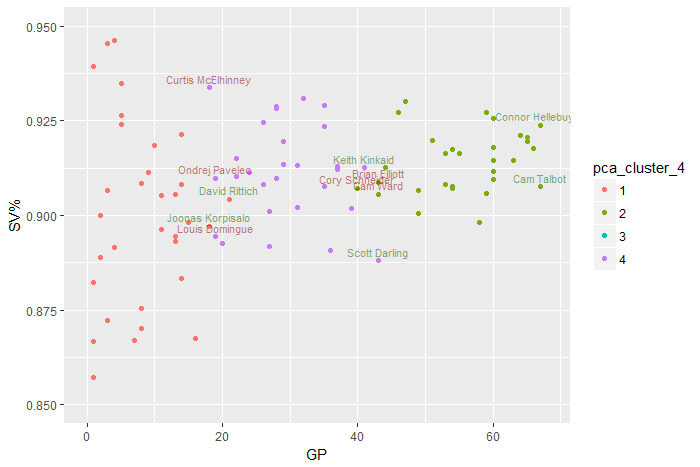
Names of netminders low in terms of GP for their cluster are colored red - perhaps we will see less of them. On the other hand, names of those on the upper end of their cluster in terms of GP are colored green. Plotting GP on the x-axis shows just how much games played explains most of the variation in these numerical data.
I think I really want to do some hierarchical clustering analysis (HCA) on this. And see what’s going on at the deeper level.
5. HCA
Let’s use some of the previous work to add names of goalies we saw before. This will help get an intuition of the clustering going on.
5.1. HCA on All Goalies
key_goalies <- goalies[85 ,] %>%
  bind_rows(prototypes) %>%
  bind_rows(up_and_up) %>%
  bind_rows(down_and_down) %>%
  group_by(`First Name`, `Last Name`) %>%
  count() %>%
  ungroup %>%
  mutate(goalie = paste0(`First Name`, " ", `Last Name`)) %>%
  select(goalie) %>%
  bind_rows()

# take the list and if the player's name is in this list
# return their name, otherwise return their rownumber

goalies$name <- paste0(goalies$`First Name`, " ", goalies$`Last Name`)
goalies$playernumber <- 1:nrow(goalies)

rownames(scaled_all_vars) <- ifelse(goalies$name %in% key_goalies$goalie,
                                    goalies$`Last Name`,
                                    goalies$playernumber)

dist_matrix <- dist(scaled_all_vars)
#colnames(dist_matrix) <- goalies$`Last Name`
hc_goalies_sc_avg <- hclust(dist_matrix, method="average")

# loop on this
linkages_to_example <- c("average", "single", "complete",
                         "ward.D2", "median", "centroid")


create_dend <- function(linkage = "ward.D2", dist_matrix){
  dist_matrix %>%
    hclust(method = linkage) %>%
    as.dendrogram()
}

plot_dend <- function(linkage = "ward.D2", dist_matrix){
  dist_matrix %>%
    hclust(method = linkage) %>%
    as.dendrogram() %>%
    highlight_branches_col() %>%
    plot(main = paste0(linkage, " linkage"))
}

dends <- map(linkages_to_example, create_dend, dist_matrix = dist_matrix)

par(mfrow = c(2, 3));
walk(.x = linkages_to_example, plot_dend, dist_matrix = dist_matrix);
par(mfrow = c(1, 1))
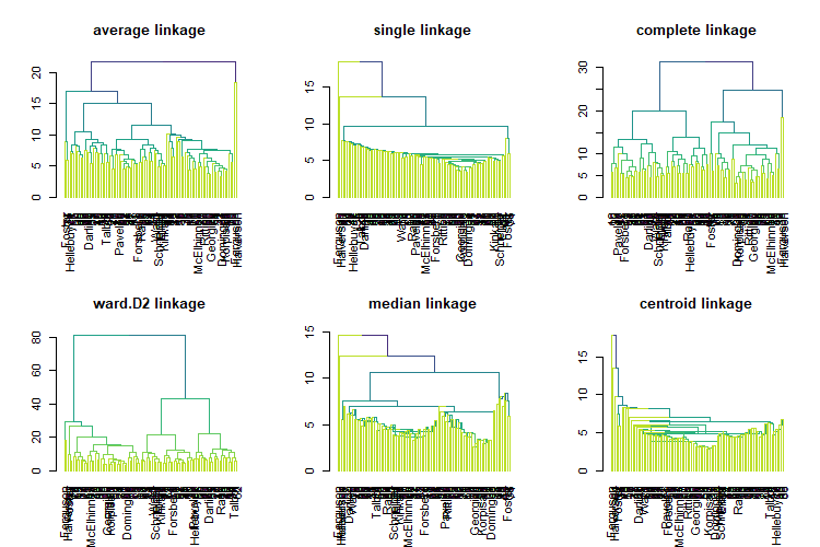
Ward’s method, ward.D2, is the most similar HCA linkage to k-means. Let’s zoom in on it.
col_vec <- ifelse(labels(dends[[4]]) %in% prototypes$`Last Name`,
       "black",
       ifelse(labels(dends[[4]]) %in% up_and_up$`Last Name`,
              "darkgreen",
              ifelse(labels(dends[[4]]) %in% down_and_down$`Last Name`,
                     "darkred",
                     "grey")
       )
)
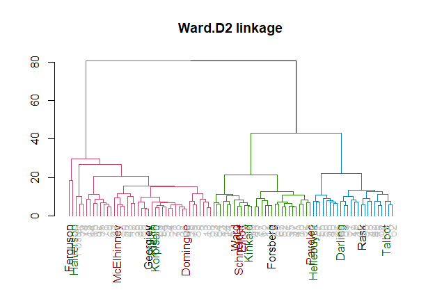
The dendrogram for Ward’s method shows a bit of why k-means with a large nstart may have picked up the 2-3 clusters it did. You have the starters (blue), regular backups with several games (green) and part time backups up from the minors (red).
5.2. Starters
Starters are the most interesting. Let’s just look at the starters and see how they cluster out.
clusters <- cutree(dends[[4]], k = 3, order_clusters_as_data = FALSE)
clusters <- clusters[clusters %in% c(1,2)]


scaled_all_vars2 <- scaled_all_vars
rownames(scaled_all_vars2) <- paste0(substr(goalies$`First Name`, 1,1), ". " ,goalies$`Last Name`)

starters <- scaled_all_vars2 %>%
  dist() %>%
  hclust(method = "ward.D2")

clusters <- cutree(starters, k = 3, order_clusters_as_data = FALSE)
clusters <- clusters[clusters %in% c(1,2)]

starters %>%
  as.dendrogram() %>%
  prune(names(clusters)) %>%
  #set("labels_col", col_vec) %>%
  set("branches_k_color", k = 3) %>%
  #hang.dendrogram %>%
  plot(main = "ward.D2 linkage")
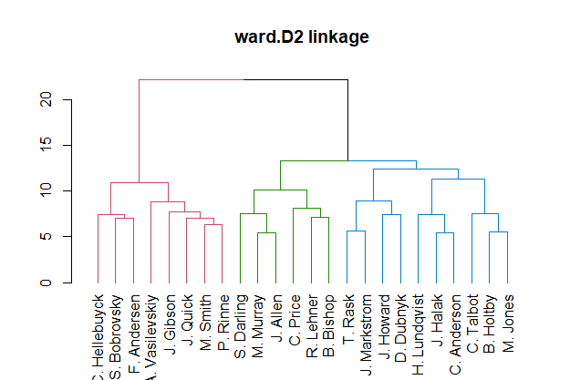
These are your three premier NHL goalie groups, I think. I feel like the red group has all the Vezina-possible goalies this year. It’d be good to take this group of starters and see what they look like from another angle.
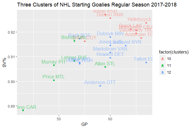
clusters <- cutree(starters, h = 13, order_clusters_as_data = FALSE)
clusters <- clusters[clusters %in% c(10:12)]

starters_to_examine <- goalies[paste0(substr(goalies$`First Name`, 1,1), ". " ,goalies$`Last Name`) %in% names(clusters), ]

starters_to_examine %>%
  mutate(name_short = paste0(substr(`First Name`, 1,1), ". " ,`Last Name`),
         name_team = paste0(`Last Name`, " ", `Team(s)`)) %>%
  left_join(tibble(clusters, name_short = names(clusters))) %>%
  select(GP, `SV%`, clusters, name_short, name_team) %>%
  ggplot(aes(x = GP, y = `SV%`, color = factor(clusters))) +
  geom_point() +
  geom_text(aes(label = name_team, vjust = -0.5, size = 3, alpha = .8)) +
  scale_alpha(guide = FALSE) +
  scale_size(guide = FALSE) +
  ggtitle("Three Clusters of NHL Starting Goalies Regular Season 2017-2018")
5.3. Comparing Linkages
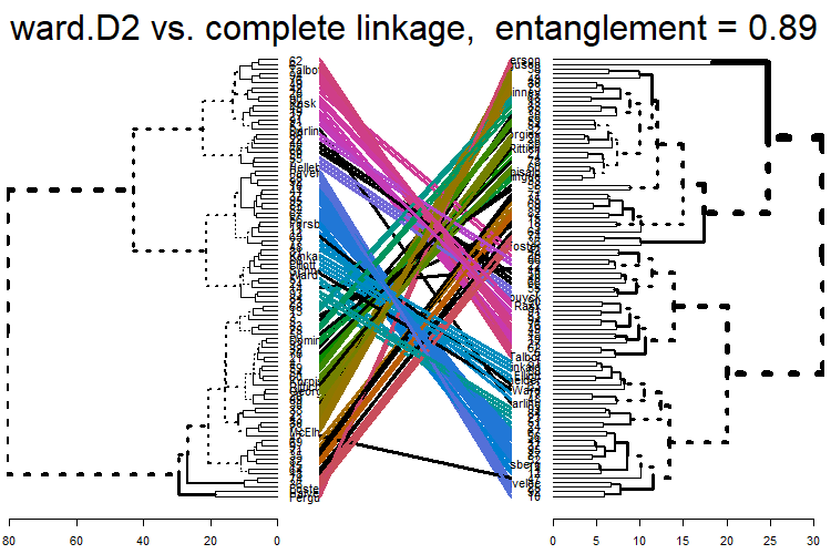
Of course there are other ways to group sub-clusters. Here a tanglegram compares Ward’s method, we’ve been discussing, with the most entangled complete linkage and least entangled centroid linkage.
dend4 <- dends[[4]] %>%
  set("branches_k_color", k = 4) %>%
  #hang.dendrogram %>%
  plot(main = paste0(linkages_to_example[4], " linkage"))

dend6 <- dends[[6]] %>%
  set("branches_k_color", k = 4) %>%
  #hang.dendrogram %>%
  plot(main = paste0(linkages_to_example[6], " linkage"))


tanglegram(dends[[4]], dends[[3]], faster = TRUE) %>%
  plot(main = paste("ward.D2 vs. complete linkage,  entanglement =", round(entanglement(.), 2)))
tanglegram(dends[[4]], dends[[6]], faster = TRUE) %>%
  plot(main = paste("ward.D2 vs. centroid linkage,  entanglement =", round(entanglement(.), 2)))
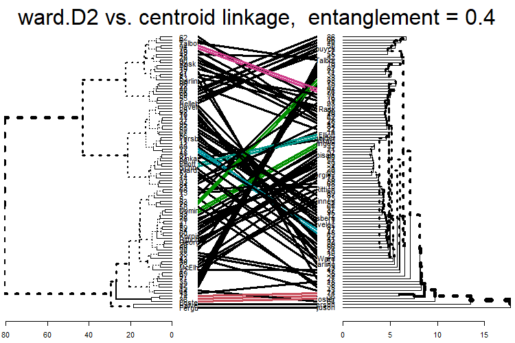
The least entanglement is with dend 6, centroid linkage. This implies it has the most similar sub-cluster structure to Ward’s.
The Winner Is
Clusters and outliers arguably don’t matter as much as one feature in particular: an indicator variable on which goalie has the last win of the season.
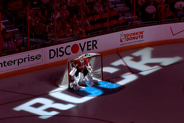
Picture by clyde
In this season, that goes to Holtbeast.