
Twitter Sentiment with R on Azure ML Studio
Downloading data from Twitter in R, running it through Azure ML Studio and analyzing the output back in R. It turns out to be rather involved. Here are the steps I’ve taken so far.
1. Create a Twitter account
Using Twitter’s API requires a Twitter account. Also need to create a Twitter App to get Keys to use the API. Can say Read/Write and give an explanation like ‘To learn about data’ as I doubt anyone looks at it unless you start tweeting 10 times a second or something. There are some instructions how to do all this at the University of Colorado Earth Lab Twitter Analytics Guide.
2. Download Twitter data with rtweet
Using rtweet found I did need to add one library, httpuv, beyond given instructions to get it to install,
### 1. Download data from Twitter -----
devtools::install_github("mkearney/rtweet")
library(rtweet)
library(httpuv)

# plotting and pipes
library(ggplot2)
library(dplyr)
library(stringr)

# text mining library
library(tidytext)
Saving my keys from my Twitter App Keys and Access Tokens in a separate file, ‘twitter pipeline not to upload.R’ I load them, and create a token that allows read and write using the API,
source('twitter pipeline not to upload.R')

# keys
# whatever name you assigned to your created app
appname <- source_appname

## api key
key <- source_key

## api secret
secret <- source_secret


# create token named "twitter_token"
twitter_token <- create_token(
  app = appname,
  consumer_key = key,
  consumer_secret = secret)
2.1 Exploring Twitter Data
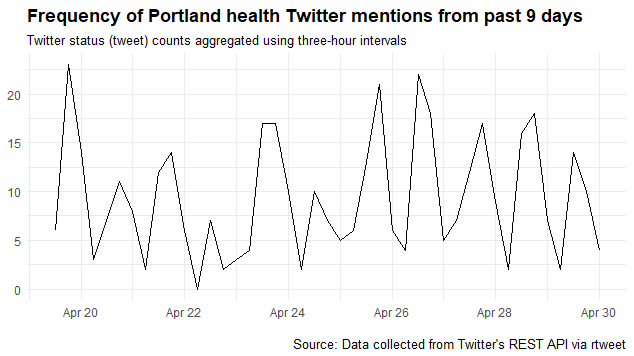
I live in Portland, Oregon and work in Healthcare so curious what people are saying about health in Portland. So this call of the API searches the last 9 days for any tweet that has both terms in it, ignoring retweets. It also plots a time series which shows seasonality by time of day - most people are tweeting in the afternoon it seems.
# ignore retweets
portland_health_tweets <- search_tweets(
  "portland+health", n = 10000, include_rts = FALSE
)

## plot time series of tweets
ts_plot(portland_health_tweets, "6 hours") +
  ggplot2::theme_minimal() +
  ggplot2::theme(plot.title = ggplot2::element_text(face = "bold")) +
  ggplot2::labs(
    x = NULL, y = NULL,
    title = "Frequency of Portland health Twitter mentions from past 9 days",
    subtitle = "Twitter status (tweet) counts aggregated using three-hour intervals",
    caption = "\nSource: Data collected from Twitter's REST API via rtweet"
  )
May be curious who are these tweeters? The top posters in the last 9 days are:
# biggest tweeters
portland_health_tweets %>%
  group_by(screen_name) %>%
  summarize(tweets = n()) %>%
  arrange(desc(tweets)) %>%
  top_n(10) %>%
  mutate(screen_name = reorder(screen_name, tweets)) %>%
  ggplot(aes(screen_name, tweets, fill = 1)) +
  geom_bar(stat = "identity", show.legend = FALSE) +
  coord_flip() +
  labs(x = "Screen Name",
       y = "Tweet Count",
       title = "Twitter users - Portland Health posts ")
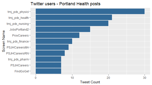
Looks like tmj_pdx is a big one. Who is that? A job aggregating site that allows people to follow their healthcare job postings as tweets. Seems a little like spam to me, but don’t have to follow them, if not in the market.
My query wasn’t specific to Portland, Oregon. I wonder how many users come from another Portland?
length(unique(portland_health_tweets$location))
Looks like 99 locations! To see what they are, requires a bit of a workaround. You’ll see if there are any UTF-8 encoded locations, R errors. So have to re-encode as Latin. Let’s see if there are any?
Encoding(portland_health_tweets$location) %>%
  table()
Encoding(portland_health_tweets$location) <- "latin1"
Indeed there was one in my dataset, and this re-encoding as latin1, allows analysis of the user’s self-reported location:
portland_health_tweets %>%
  group_by(location) %>%
  summarize(tweets = n()) %>%
  arrange(desc(tweets)) %>%
  top_n(10) %>%
  mutate(location = reorder(location, tweets)) %>%
  ggplot(aes(location, tweets, fill = 2)) +
  geom_bar(stat = "identity", show.legend = FALSE) +
  coord_flip() +
  labs(x = "Location",
       y = "Tweet Count",
       title = "Twitter user locations - Portland Health posts ")
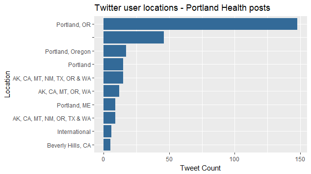
Looks like most are in Portland, Oregon, but a few are not really clear, and some are Portland, Maine. I bet the unclear ones are the auto-posting job aggregators. Could be a lot of analysis of who’s tweeting what, but let’s move on to uploading data to Azure ML to process.
2.2 Preparing the text to upload
If you check your data, you’ll no doubt see some UTF-8 and “/n” new lines, so have to process those,
head(portland_health_tweets$text)

Encoding(portland_health_tweets$text) %>%
  table()

Encoding(portland_health_tweets$text) <- "latin1"

# remove '\n' since it loads as two lines
portland_health_tweets$stripped_text <-
  gsub("\\n"," ", portland_health_tweets$text)
Finally we can output a .csv to upload to Azure. Here I’m creating a data.frame that has one column, sentiment, that is always 0. This is an artifact of how I used ML Studio. I need to clean it up. That field is not used in prediction. Only the processed tweet_text is used.
# alright let's send this up to AML for sentiment prediction
output_file <- data.frame("sentiment" = 0, "tweet_text" = portland_health_tweets$stripped_text)
write.csv(output_file, "portland_health_tweets.csv", row.names = FALSE)
Ready to go, in 5….4….
3. Create an Azure ML Studio Prediction Experiment to classify Tweets
This part takes time. I used this walkthrough as a guide. It took a few hours. I also created a free Azure account following some guidance from many help files and these two videos:
- An Introduction to Data Science on Azure
- Getting started with Azure demo, kind of C# heavy, only watched half so far
The end product is pretty looking and relatively easy to follow the logic, if not a bit over-structured for many things.
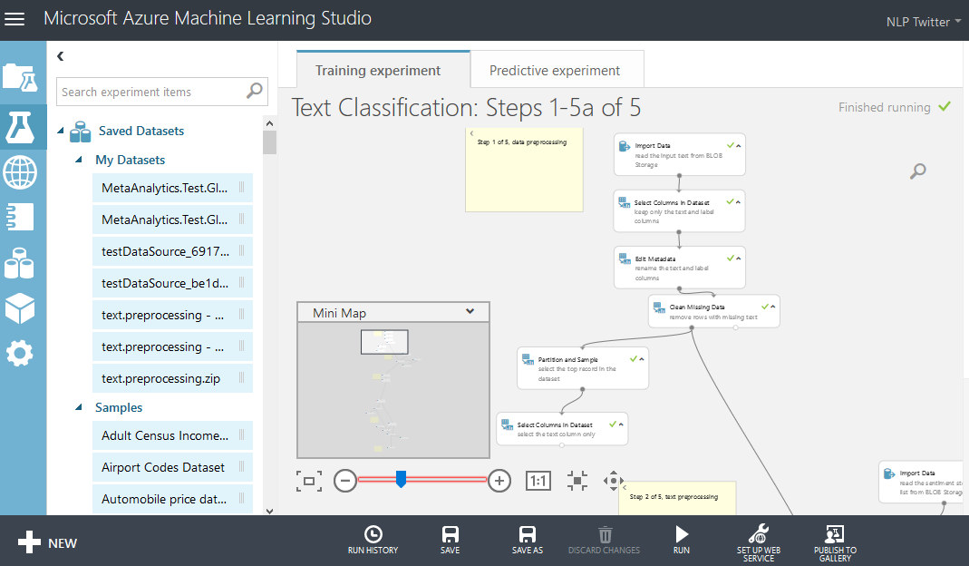
It’s a lot of work and persistence to go through all the help files it takes to set this all up. They keys are always asked for, and not always easy to find. I’m glossing over probably the hardest part. It can be done, but it takes time. Lots of errors needed to be debugged - for example, sometimes need to use Classic Service rather than New Service. Sometimes the data comes back differently than expected (see the new line issue above). I had to upgrade my Azure ML server to process the example in the walk-through. Also turned off my VM machine I’d spun up from the second video, as detailed in the money saving tricks at Top 10 Tricks to Save Money with Azure Virtual Machines
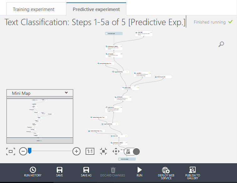
Azure ML Studio does seem heavily geared towards creating a prediction API, so that’s what my result prediction model above next turned into. Eventually I did get a request-response (1 tweet at a time) API up and running. You can test it at: https://twitternlp.azurewebsites.net/Default.aspx
Also got a nice batch API, showing the tweets output file about to be processed below.
4. Process Tweets
First time you upload, could do it here as an upload. Going forward, once it’s uploaded, if you make any changes to the model and want to rerun on the same data, can do it from the Blob Storage:
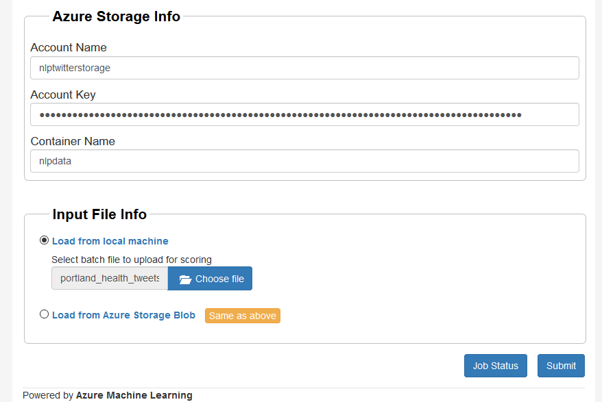
Hitting submit, it may take a little time to process, but eventually the file is done and can be downloaded.
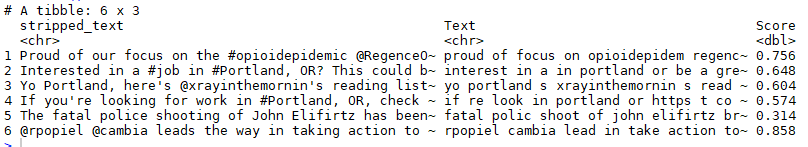
Pasting it next to the original, can see stemming as removed suffixes and a sentiment prediction for each text is produced. Let’s take a look at these ML predictions.
5. Analyze Results
processed_predictions <- read.csv('output1_050118_032952.csv', stringsAsFactors = FALSE)
processed_predictions %>%
  dim()

portland_health_tweets %>%
  dim()
Both have 403 rows, thank goodness. They do actually line up in this case.
portland_health_tweets_pred <- portland_health_tweets %>%
  bind_cols(processed_predictions)

portland_health_tweets_pred[c('stripped_text', 'Text', 'Score')] %>%
  head()
If we sort by sentiment, we can see what the happiest tweet says:
portland_health_tweets_pred %>%
  select('stripped_text', 'Score') %>%
  arrange(desc(Score)) %>%
  top_n(1) %>%
  as.data.frame()
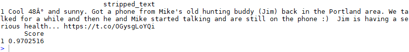
So this does seem like a kind of happy text. Why does it give it the highest score at 0.97? Within the black box model are two key ideas.
One is the model predicts sentiment essentially as defined as a happy emoticon, e.g. :) or :-D vs. a sad emoticon, e.g. :( or :,-( That is not the most common definition of sentiment, which may be Bing, but it does allow for other options than unigrams, in this case, bigrams translated into effectively processed, but black box, hashed features. That’s the second key idea.
Based on the word clouds generated before feature hashing, my guess is some key words like “cool”, “sunny”, “buddy”, “talked” and “health” tend to have to be associated with a smiley face. Sure enough, there is one in the tweet.
Which is the saddest tweet about health in Portland in the last 9 days?
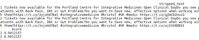
Looks like a tie. Talks about “pain”, “problems”, “working”. Almost makes me want to frown. But it isn’t really as sad a text as would seem. Would be good to peer into the hood and output why the model thinks this is likely to have a sad emoticon.
Finally, let’s take a look at the distribution of happy and sad.
portland_health_tweets_pred %>%
  select('Score') %>%
  qplot() +
  labs(title= "Tweet Happiness Score")
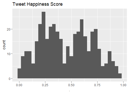
Looks bi-modal.
Wonder if there’s any trend over time?
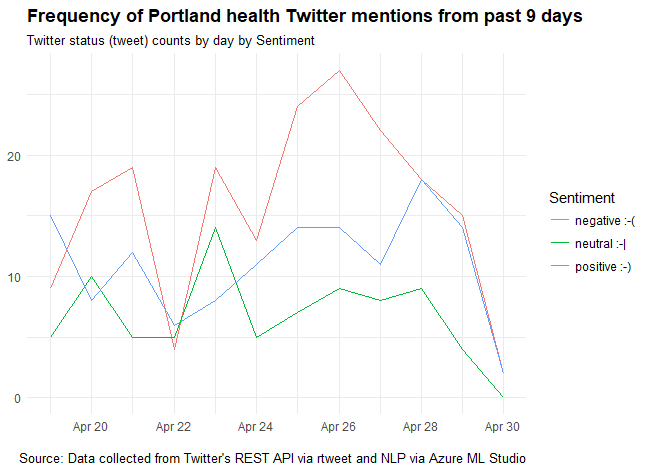
portland_health_tweets_pred %>%
  group_by(Sentiment) %>%
  ts_plot("24 hours") +
  ggplot2::theme_minimal() +
  ggplot2::theme(plot.title = ggplot2::element_text(face = "bold")) +
  ggplot2::labs(
    x = NULL, y = NULL,
    title = "Frequency of Portland health Twitter mentions from past 9 days",
    subtitle = "Twitter status (tweet) counts by day by Sentiment",
    caption = "\nSource: Data collected from Twitter's REST API via rtweet and sentiment via Azure ML Studio API"
  )
Looks like people tend to have negative sentiment about health in Portland, and especially so on Thursday, April 26th. Though it could be noise, could look up the news, or could look up most common hashtags in negative sentiment tweets from the three days around it.
portland_health_tweets_pred %>%
  filter(Sentiment == "negative :-(",
         created_at >= '2018-04-25',
         created_at <= '2018-04-27') %>%
  select(hashtags) %>%
  unlist() %>%
  table() %>%
  sort(decreasing = TRUE)
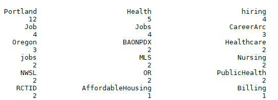
I see a few soccer references in here. I wonder if a local team lost a game around then? Neither the men’s now women’s professional teams had games then, so goes to show how much people love their soccer here, they add it to their tweets about health.
What I do see are a few “sad sentiment” job postings. It can be hard out there.