ASA Conference on Statistical Practice 2018, Friday 4 of 6, Working with Health Care Data
Highlights from Conference on Statistical Practice.
Friday 2/16/2018
- 8:00 AM Keynote Address & 9:15 AM Working with Messy Data
- 11:00 AM Streamlining Your Work Using (Shiny) Apps
- 2:00 PM Data Mining Algorithms / Presenting and Storytelling
- 3:45 PM Working with Health Care Data
- Posters I Wish I’d Seen
- Additional Sessions I Wish I’d Attended
Saturday 2/17/2018
- 9:15 AM Poster Session 3 / Survival Analysis v. ‘Survival’ Analysis
- 11:00 AM Causal Inference
- 2:00 PM Deploying Quantitative Models as ‘Visuals’ in Popular Data Visualization Platforms
- Additional Sessions I Wish I’d Attended
3:45 PM Working with Health Care Data
Application of Support Vector Machine Modeling and Graph Theory Metrics for Disease Classification Jessica Michelle Rudd, Kennesaw State University
Problem: Diseases tend to occur in related populations, but disease prediction classification tasks usually ignore relationships.
Rudd took an SVM model and added some relationship modeling with graph theory to improve prediction accuracy. She took on two prediction tasks: Diabetes (undiagnosed or diagnosed) vs no DM, and undiagnosed DM and pre-diabetes vs. no diabetes. It used 14 typical variables from NHANES, and did reasonably well with test set AUCs around 0.83 and 0.73 respectively.
Rudd explained the biggest issue with using graph theory to model connections among people is lack of available data. She simulated the data using a Watts-Strogatz small world network model to create a simplified network. This was using igraph package in R. However, the models didn’t turn out that great in terms of AUC, around 0.65.
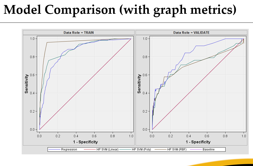
Rudd also performed a behavioral risk factor prediction task on suicidal ideation with ROC curves shown below. Actually, if you look at the testing set I’d say logistic regression looked like it handled the social network information better. I wonder if this is because the network was simulated, so not informative, so lasso would have removed it.
She mentioned a Google arXiv paper on ICD-9 code discharge prediction that applied deep learning on FHIR data to predict all discharge ICD codes at an AUC of 0.90. I don’t know how hard that task is, but some of the other tasks apparently did better than industry standard at least.
The right format of EHR data should be very informative, in theory. But in this study the authors are missing claims, and that could be the thing that makes the difference for true value. My suspicion is these authors are using unrealistically clean EHR data, though, as deep learning tends to require less noise than other approaches. Also telling, is their next step is to try to show providers what the model is doing. Providers don’t trust black boxes, and I think this will be harder than they think, but may be possible. Anyone who knows a little about the history of medicine will know why a good doctor won’t trust a black box prescriptive model.
Assessing Correspondence Between Two Data Sources Across Categorical Covariates with Missing Data: Application to Electronic Health Records Emile Latour, Oregon Health & Science University
Problem: Missing data complicates any analysis. Ignoring or editing the missing data leads to problems including loss of information leading to loss of power, biased results, and unreliable results. Electronic Health Records (EHRs) are not designed for research so have a lot of missing data that needs to be addressed in order to draw reasonable conclusions.
Compared to “gold standard” Medicaid data, the EHR is missing data on race and federal poverty level. Latour uses imputation to try to solve this and the Medicaid data to check results. Specifically, he uses Stef Van Buuren’s multivariate imputation by chained equations (MICE). Race was missing in 6.7% of cases, and federal poverty level in 20.7% of cases. In this presentation, he described the decisions he made to apply MICE to impute those two fields to reduce information loss.
When working with missing data–to determine which missing data methods are appropriate–you need to consider Pattern (i.e. which values are observed and which are missing) and Mechanism (i.e. relationship between missingness and values of the variables in the data).
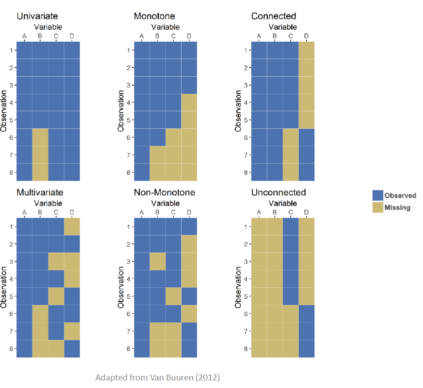
In terms of determining the pattern, Latour gave 6 examples of typical patterns of missing data, such as monotone (whereupon variables on observational units drop out never to return), or connected (whereupon variables on observational units drop out for periods of time). Visualized, these patterns would look like the following plots:
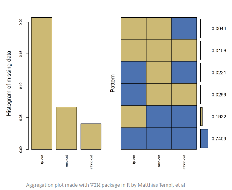
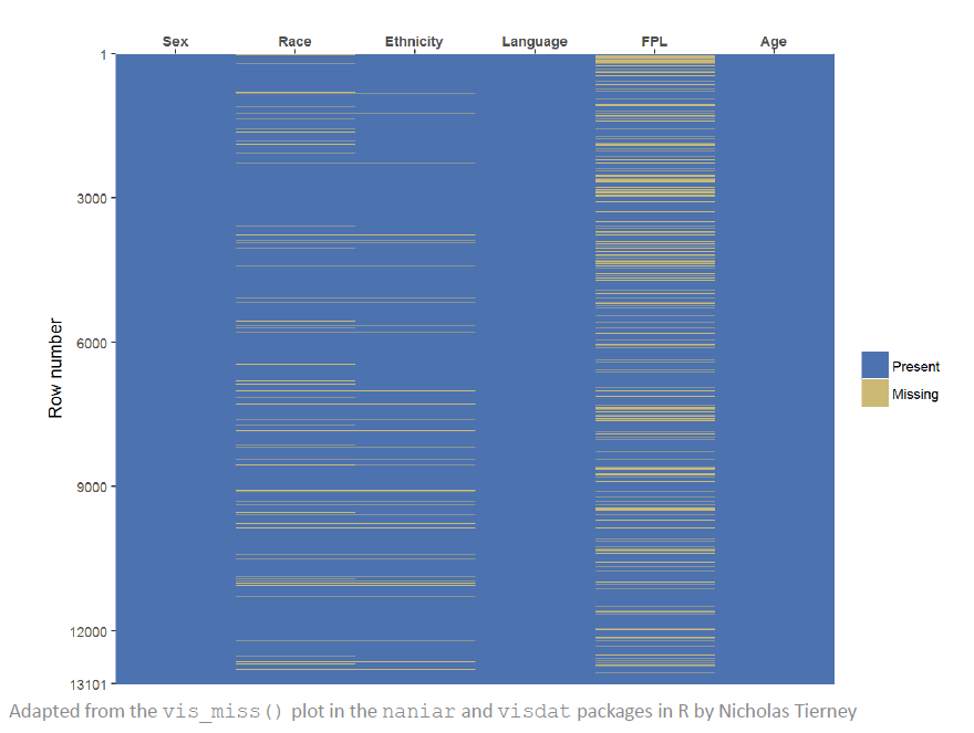
Latour recommends visualizing the data by missingness to see these kinds of patterns. His example shows that FPL is most frequently missing and Race is next.
The VIM, naniar, and visdat packages were referenced in this talk. Latour seemed to think the aggregation plot from VIM (at top of page) is useful.
Beyond pattern, “mechanism for missingness” examines the “reason” for missing values. A good first starting point is considering which of Rubin’s three categories applies to your missing data:
- Missing completely at random (MCAR) Missing value does not depend on the observed data or the missing data. Missing data are a random subset. Example: flip a coin before deciding to answer FPL question.
- Missing at random (MAR) Missing value may depend on observed data, but it does not depend on the missing data. Possible that missingness can be predicted from other available data. Example: men are more likely to not answer FPL, but it does not depend on FPL.
- Missing not at random (MNAR) Not MCAR and not MAR. Probability that a value is missing is associated with the missing variable itself and with other variables. Example: people with low FPL are less likely to answer questions about their FPL.
I’ve seen this distinction frequently, so it’s worth remembering next time someone says “Just impute with the mean and everything will be dandy!” Most of the common approaches (including imputing mean/median or missing indicators assume MCAR, usually incorrectly,) lead to reduced power and increased bias. Better approaches include the the best but computationally intensive likelihood methods, obtaining alternative sources of information, weighting methods (e.g. inverse probability weighting), and, the topic of this talk, arguably second best and less computationally intensive, multiple imputation.
I liked Latour’s summary of multiple imputation:
- A statistical method for analyzing data sets with missing values
- Basic idea is to substitute a reasonable guess (imputation) for each missing value, multiple times
- Creates multiple “complete” data sets
- Analyze each data set separately and then combine (or pool) the results
MICE, as an instance of MI, specifically:
- Flexible approach to multiple imputation
- Unnecessary to assume that the variables share a common distribution
- Can more easily work with large data sets with complex data structures
- Models more accurately reflect the distribution of each variable
- Theoretically weaker than joint modeling
- Incompatibility of conditionals i.e no joint distribution exists for the specification of conditional distributions
- In simulation and in practice, the method seems to be robust when the conditions are not met
He uses the R package mice. The steps to use it are:
- The analyst/researcher decides on an imputation model for each variable given the information available. The R package has default methods by variable type of: a. Numeric: Predictive mean matching b. Binary: Logistic regression c. Nominal: Multinomial logit model d. Ordinal: Ordered logit model
- Each variable at a time gets its values imputed
- On a second iteration, a given column in focus will again have its missing data imputed using the imputed information in the other variables from the previous run.
- Parameters for the underlying assumed model method in step 1 are calculated by regression
- Missing values are filled in using the predictive model from step 4
- Repeat for all missing variables and observations
- These steps are repeated for 10 to 20 cycles until results have stabilized.
- The above steps are repeated m times to get m imputed data sets.
The model determined in the challenging set up stage should
- Account for the process that created the missing
- Preserve the relations in the data
- Preserve the uncertainty about these relations
MICE author, Stef Van Buuren, provides 7 considerations to take in order:
- Decide if MAR assumption is reasonable
- Decide on the form of the imputation model (such as the R mice defaults in step 1 above if nothing better)
- Decide the set of predictors to include in the imputation model
- Decide whether to impute variables that are function of other (incomplete) variables.
- Decide the order in which variables should be imputed
- Decide the number of iterations (such as 10 to 20)
- Decide m, the number of multiply imputed data sets. a. Rule of thumb from recent authors is m should be similar to the percentage of cases that are incomplete (at least 5)
Latour goes on to give thorough general advice about variable selection to make MAR assumption more reasonable. He suggests aiming for 15-30 variables, subsetting if necessary. Variables to include are ones either of study interest, related to occurrence of missing data, differently distributed than the response, or are correlated with the target missing data variable. Variables with too many missing values, or too often missing on the same observational unit as an imputation target variable, should possibly be dropped.
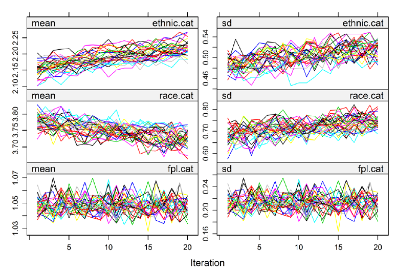
Also, since 10-20 iterations are done, you need to check that convergence occurred in those limited number of steps. (I kind of find methods that require checking for convergence annoying, almost less believable, though logistic regression requires it (hence all the exciting warnings from R about variables not converging)). The mice package plots the streams which should hopefully be both well mixed and have no trend. In this example, these are well mixed, hence the headphone-wires-just-out-of-my-pocket look, but have trend. In Removing ethnic.cat, the trending goes away.
Latour also recommends data visualization after imputation to make sure imputed values are close to original data, in a plausible range, and make common sense (e.g. no pregnant fathers). These visuals can be pretty basic. He had a simple line plot with categories on the x-axis and % of observation on the y-axis.
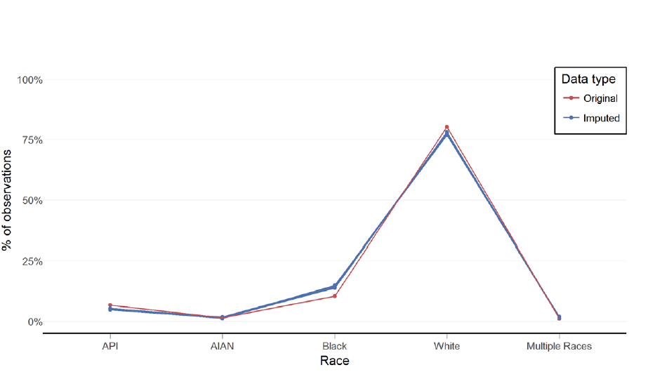
Latour went through visualization checking with his Medicaid data example, and ended up with imputed results similar to drop.na original data, which is not always the case. Further diagnostics are available to assess the MAR assumption made in MI and to assess distributions of imputed data. He concludes MICE is a viable method to address missing data in EHRs.
There are guidelines on reporting results using MI, I think relevant for publishing, not for convincing stakeholders. If someone uses MI, there are a lot of questions that need to be addressed to bew thorough before accpting their results.
Code from this presentation is available!
up next: Posters and Additional Sessions I Wish I’d Attended