ASA Conference on Statistical Practice 2018, Friday 5 of 6, Posters I Wish I'd Seen
Highlights from Conference on Statistical Practice.
Friday 2/16/2018
- 8:00 AM Keynote Address & 9:15 AM Working with Messy Data
- 11:00 AM Streamlining Your Work Using (Shiny) Apps
- 2:00 PM Data Mining Algorithms / Presenting and Storytelling
- 3:45 PM Working with Health Care Data
- Posters I Wish I’d Seen
- Additional Sessions I Wish I’d Attended
Saturday 2/17/2018
- 9:15 AM Poster Session 3 / Survival Analysis v. ‘Survival’ Analysis
- 11:00 AM Causal Inference
- 2:00 PM Deploying Quantitative Models as ‘Visuals’ in Popular Data Visualization Platforms
- Additional Sessions I Wish I’d Attended
5:00 PM Poster Sessions
Curating and Visualizing Big Data from Wearable Activity Trackers Meike Niederhausen, OHSU-PSU School of Public Health
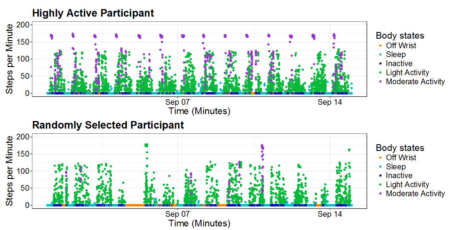
Problem: data from a wrist health device tracker study involving 500 people is messy. How can visualization help separate useful data from not useful data?
They had to throw out the first week (Hawthorne Effect) and implausible values such as 10000 steps in one minute (manual entry?). They also had to limit to people who had enough activity and didn’t just take the watch off for days and days. Can see examples of kinds of data errors and variation by day by activity level of participant in above scatterplot.
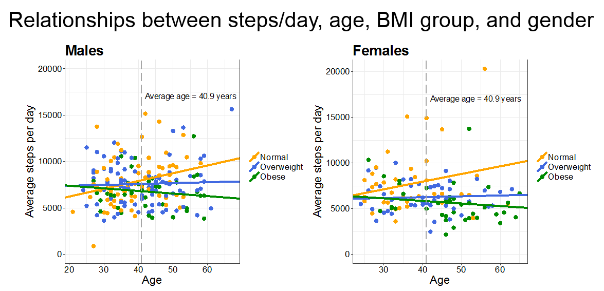
Interestingly they appear here to have found a three-way interaction term of predictive worth. We learn to generally avoid three way interaction terms as they’re hard to make sense of both conceptually and theoretically. This demonstrates one way to approach trying to visualize such an interaction term to get at the former. The slopes by BMI group across gender really are quite similar, though, so I wonder if this implies a two way interaction is sufficient? In this case it would be BMI group by age regressed on average steps per day. Gender doesn’t look significant in terms of slope.
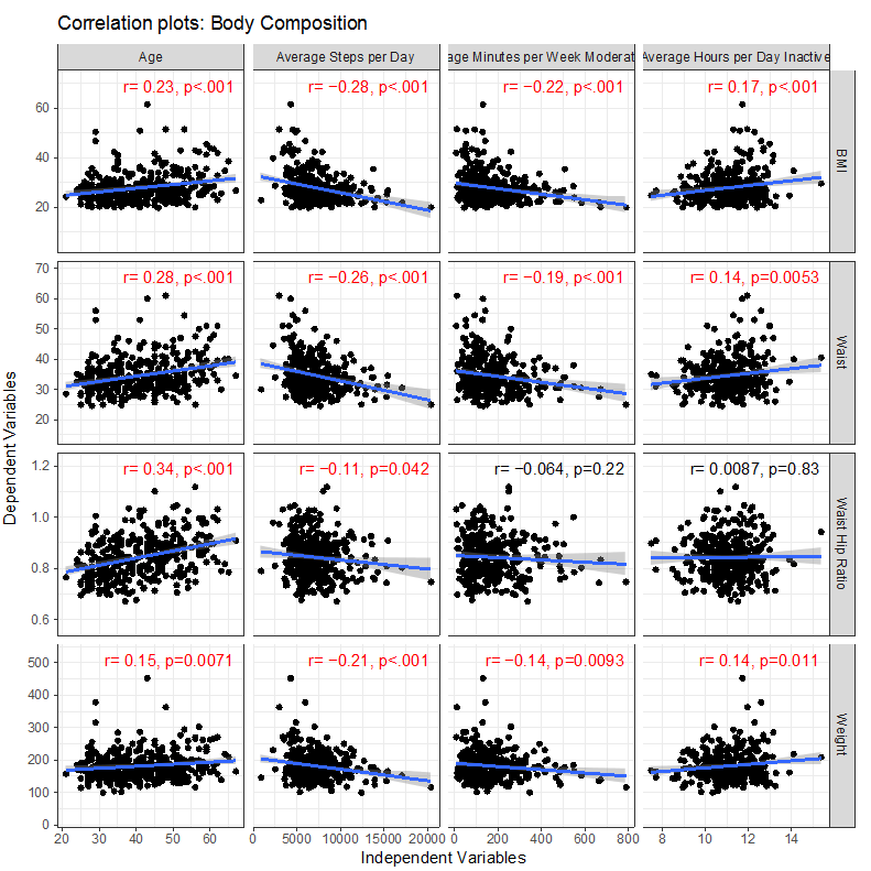
I liked these plots showing the correlation of different activity levels with health outcomes. Maybe useful for exercise motivation? Not sure exactly who the study can be inferred to, especially after the data cleaning, but suggestive of reasonable hypotheses. I’m not sure about the multiple hypothesis testing if they did any correction, and if the p-values could be taken on face value given the data cleaning choices, but it offers an awesome glimpse into this, as I’ve seen first hand, difficult, highly personal data. One thing I notice is in each column the slope has the same sign - this makes sense as for each variable on the y-axis, lower is associated with better health outcomes.
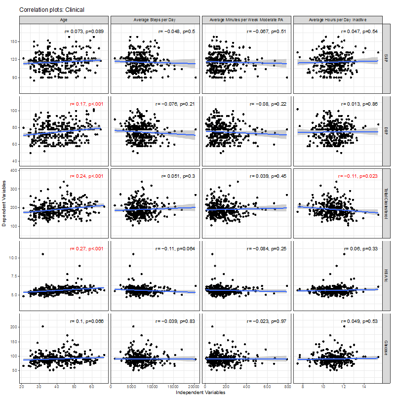
It’s interesting to see, on the other hand, how little linear correlation there was with clinical values like blood pressure. I’m surprised to see Diastolic blood pressure goes up with age of these participants, but not Systolic blood pressure. There’s really nothing much going on besides age here. One wouldn’t expect numbers like HbA1c, a long-term measure of diabetes, to be affected much by this study over a few weeks, so would expect correlations to have more to do with pre-existing habits, and so it’s surprising there isn’t more going on in this population. Wonder if this sample does represent typical adults. It’s weird too because one would expect the numbers in the other charts like BMI to correlate with HbA1c, but I think this implies in these data, it doesn’t. Shows just how challenging research with health tracker data can be.
The Boeing Applied Statistics ToolKit: Best Practices and Tools for Collaboration and Reproducibility in High-Throughput Consulting Robert Michael Lawton, Boeing Research & Technology
Problem: In fast-paced statistical consulting, balancing quality, reproducibility, and urgency is challenging.
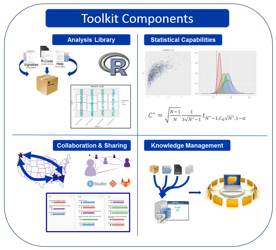
Boeing Research and Technology’s Applied Math Group of 50 mathematicians developed an applied statistics toolkit to help solve this problem. It has:
- Set of analysis libraries (reusable R code, vignettes, and help)
- Collaboration best practices (R Studio, Git)
- Knowledge management system
- Program for vetting new statistical capabilities
Unfortunately their presentation live had a lot more interactive detail than as posted as a static .pptx file, but appreciate the careful, thoughtful planning they shared to handle an all-too-familiar challenge of “technical debt” in industry.
Estimating the Relative Excess Risk Due to Interaction in Clustered Data Settings Katharine Correia, Harvard T.H. Chan School of Public Health
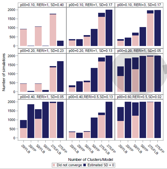
Problem: interaction terms for relative risk coefficients can be difficult to estimate with frequentist methods. Can a Bayesian approach help?
In simulated clusters, often frequenstist approaches to handle interactions did not converge, especially log binomial random intercepts models (FLB bars here) and were especially poor with higher standard devisions of random intercepts (SD here)
She was able to apply rstan package in a Bayesian approach and find a small but significant interaction in absolute risk between age and BMI in terms of live birth from in vitro fertilization. (Risk of success?) In another case, she detected a more dramatic 25% increase in risk of preterm delivery from interaction between nevirapine exposure at conception and poor immunological health.
This kind of analysis could be important for precision medicine, where we want to start grouping patients into smaller buckets and asses how they will react to different treatments.
Exploratory Analyses from Different Forms of Interactive Visualizations Lata Kodali, Virginia Tech
These posters are often interactive when seen in person. Nothing posted yet.
Using SAS Programming to Create Complex Paneled Graphs from Electronic Health Records Carrie Tillotson, OCHIN, Inc.
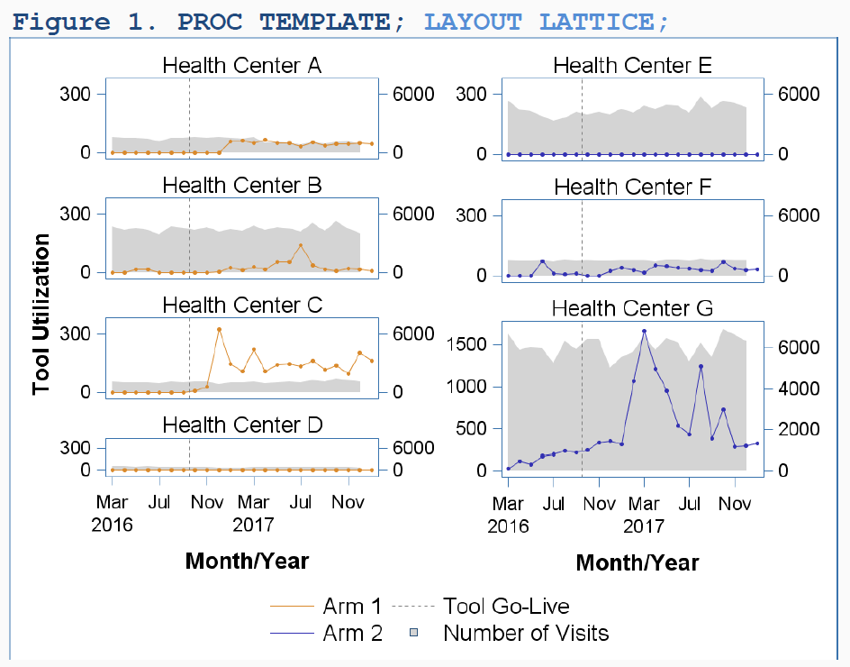
Problem: a new electronic tool is being implemented - can the changes in key variables before and after be measured and displayed in a visually meaningful way?
They implemented an insurance tool in their electronic health records and tracked changes in an important response over time (maybe count of Medicare billings?) at different facilities. They were able to show these plots to staff at the facilities to give insight how practices had or had not changed since tool implementation.
An Algorithm to Identify Family Linkages Using Electronic Health Record Data Megan Hoopes, OCHIN, Inc.
Problem: Health factors highly correlate among family members but explicit family links are often missing from medical records. Is there a reproducible way to impute links between family members in EHRs?
Their strategy to find family links included identifying key fields such as address, home phone, insurance carrier, and fuzzy matching on mother emergency contact phone number, and cases to exclude such as when it looks like there are two adult females in the household so the biological mother is less clear. and then compare this to a “gold standard” data set. In the end, in a pediatric dataset they linked 382,000 mother-child relationships, of which only 44% were explicitly stated in the EHR.
Some caveats: has high precision but low sensitivity - that is the matches it makes tend to be true, but the number of matches caught is low. Also, this method really is limited to household units not genetic relationships.
This plot shows accuracy of linkage is higher with younger children, and children who go to the doctor more often (younger children go to the doctor more so same or different people?)

Developing a Comprehensive Personal Plan for Teleworking (Working Remotely) Julia Lull, Janssen Research & Development, LLC
Problem: so you’re thinking of working remotely full or part time, but don’t know what you need to consider and how to pitch it to your company.
The poster spells out some nice common sense advice. It covers as a manger of a potential teleworker what to consider, and as a potential teleworker the pros and cons. I thought the pros are obvious, but cons are interesting. These included:
- Career limitations/less visibility
- Loss of company cafeteria/gym
- Limited participation in formal and informal gatherings (holiday parties, ice cream socials)
- Difficult to get to know new employees as well
She recommends developing a personal plan. That needs to include:
- specific detailed reasons for wanting to telecommute
- working hours and location details - full time or some days? Location? How often to come into the office and where to sit? And describe home office setup.
- any changes needed to your goals and objectives?
- what challenges will your remote work have for others (internal and external customers, manager and direct reports) and solutions/mitigations to these
- describe potential positive impacts and anticipated advantages
For buy-in she reminds people to get buy-in from family, discuss with manager first then coworkers, obtain feedback from coworkers on concerns prior and after a pilot run to make adjustments to the plan. Finally, while at home, some things to consider:
- Minimize distractions – have separate, dedicated workspace
- Furniture – who purchases?
- Internet/phone service – reimbursed?
- IT issues – how will be resolved?
- How will you communicate vs. how you communicated in office (email, voicemail, phone, IM, teleconferences, etc)
- Have a start/stop time – regular hours
I think the last point is important. Working remotely some days I find I want to get a full day’s work done. But sometimes things come up, like going to a long lunch or cleaning the house, and this is a positive for me, but means I sometimes feel my work day never ended. Some trade-offs there. But without the strong line of the commute, it is important to have some plan or another, even if it’s just 8 hours work throughout a whole day, that can consciously balance these needs.
Combining Historical Data and Propensity Score Methods in Observational Studies to Improve Internal Validity Miguel Marino, Oregon Health & Science University
Not yet posted online.
Limitations of Propensity Score Methods: Demonstration Using a Real-World Example Gregory B. Tallman, Oregon State University/Oregon Health & Science University
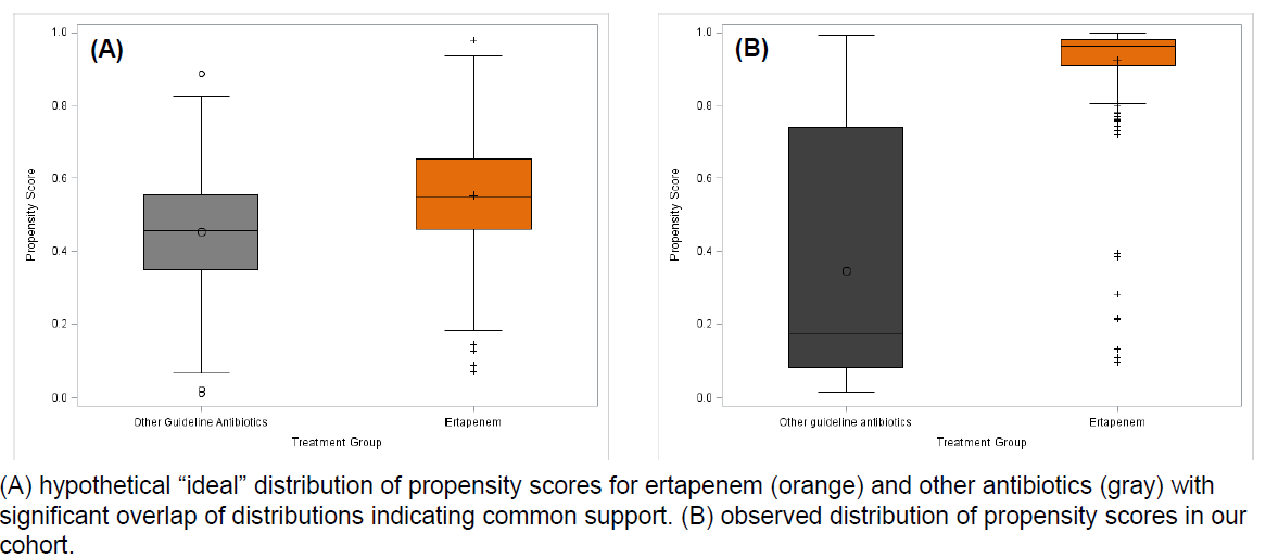
Problem: propensity scores offer an increasingly popular set of methods to control for confounding in observational studies, but what are their limitations and how can we see if they are not sufficient for a scientific conclusion?
Long story short: after fitting propensity scores the common support was too low. This is seen in plot B below, as compared to the “ideal” use of propensity scorers where selection bias isn’t huge. A priori knowledge of clinical factors associated with treatment selection and diagnostics like this and standardized differences of variables before and after weighting can help indicate when there is too much confounding remaining after propensity score matching in an observation study.
Appropriate Dimension Reduction for Sparse, High-Dimensional Data Using Intensity Plots and Other Visualizations Eugenie Jackson, West Virginia University
Problem: PCA can often help with visualizing clusters in data, but when a dataset is sparse and high dimensional, the first two principal components may only explain say 14% of the variation. How many PCs do you need?
She uses a color-coded scree plot to quickly gage need for number of principal components to visualize. She then uses three kinds of plots based on combined principal components. An Andrews’ plot uses Fourier series to highlight clusters and outliers and can be animated for many possible 2-D projections with R package tourr. She animates the changes as 1 to 15 principal components are added.
A second visual, intensity plots, show distance patterns across dimensions (principal components). I think these summarize, for an observation, for each principal component, how unusual is that observation? Observations with similar such distance patterns may mean an interesting story is there.
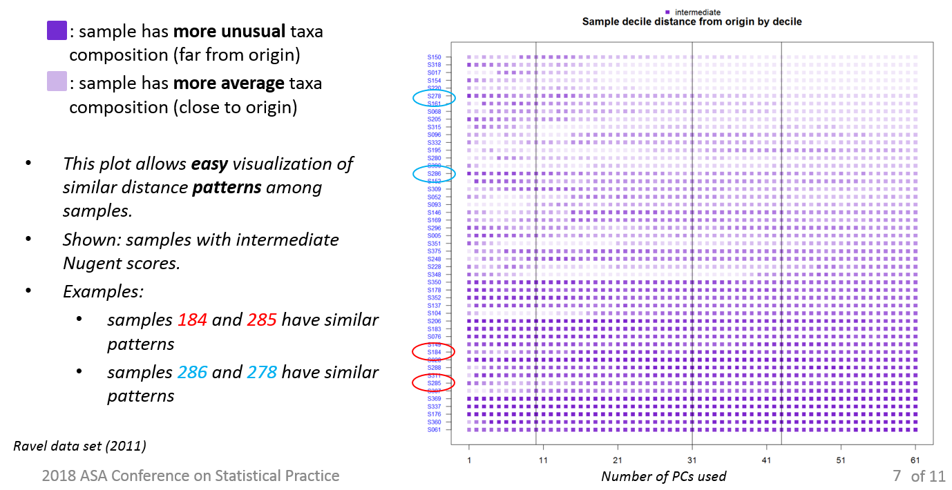
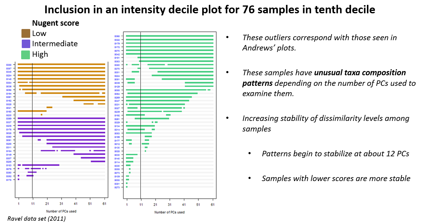
A third visual, inclusion in an intensity decile plots, focuses attention on a single decile of intensity, which I think measures disimilarity from a medoid observation. So this 10th decile is the “most intense” that is, most dissimilar I think, the outliers that are hardest to cluster. I think the story is these rows are outliers because each drops on and off a cluster with different dimensions of principal components considered.
To get a sense how many dimensions are needed for analysis, she uses a plot of Jaccard similarity vs. number of PCs. And based on (the most central decile of observations?) decile 1, determines 12 dimensions provides enough information for dimension reduction in this case for her research question.
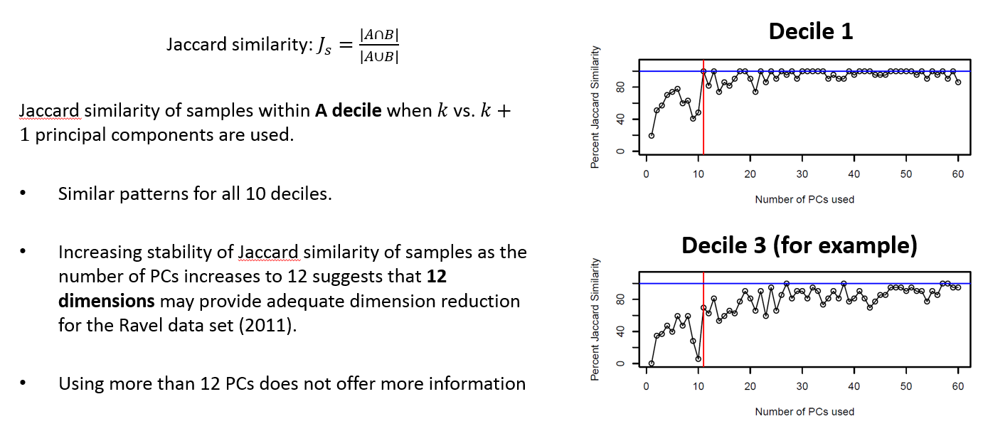
I don’t really have a clear sense from the poster how to read these plots, what they mean and what they don’t, but they do look helpful to get to answering the question of how many principal components are needed for sufficient summary in most use cases. Her code is available to work with.