ASA Conference on Statistical Practice 2018, Friday 6 of 6, Additional Sessions I Wish I'd Attended
Highlights from Conference on Statistical Practice.
Friday 2/16/2018
- 8:00 AM Keynote Address & 9:15 AM Working with Messy Data
- 11:00 AM Streamlining Your Work Using (Shiny) Apps
- 2:00 PM Data Mining Algorithms / Presenting and Storytelling
- 3:45 PM Working with Health Care Data
- Posters I Wish I’d Seen
- Additional Sessions I Wish I’d Attended
Saturday 2/17/2018
- 9:15 AM Poster Session 3 / Survival Analysis v. ‘Survival’ Analysis
- 11:00 AM Causal Inference
- 2:00 PM Deploying Quantitative Models as ‘Visuals’ in Popular Data Visualization Platforms
- Additional Sessions I Wish I’d Attended
Sessions I Wish I’d Attended, Slides Reviewed in Retrospect
What Does It Take for an Organization to Make Difficult Information-Based Decisions? Using the Oregon Department of Forestry’s RipStream Project as a Case Study Jeremy Groom, Groom Analytics
Problem: if data suggests a course of action vested interests don’t want to take, how can it still be taken?
Heard this session was one of the most interactive of the conference. He discussed a case where data implied a hard decision needed to be made, with a lot of stakeholders on both sides. His process of handling these situations sounds nuanced and he shares a lot of lessons learned from this work. I especially like his advice for working with stakeholders:
- Individuals matter
- Frequent communication + transparency + fairness = trust
- Getting feedback before analyses may increase buy-in
- Setting groundwork for next project
Some other useful reminders to me anyway:
- Small successes help with morale
- Shield tech staff from politics
- Courage to have difficult conversations
- Provide room to fail, suspend disbelief
- Own the findings
- Retain dedicated staff
- Decision-makers want decision space (Bite-sized decisions)
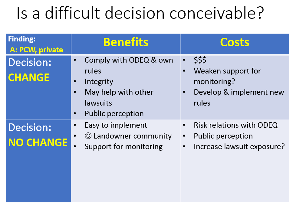
I like this simple layout of costs and benefits of action and no action - takes some of the emotion out of it and lays all cards on the table.
Developing and Delegating: Two Key Strategies to Master as a Technical Leader Diahanna L. Post, Nielsen, Columbia University
Problem: leaders of technical teams have additional challenges to best use their technical talent and these skills don’t happen automatically. Technical people who are new leaders of technical teams have a daunting set of soft skills needed to manage a team. Which ones could they focus on?

She recommends focusing on two skills: Developing your team and delegating work to your team. The slides are quite structured and probably worth rereading every few months as a leader of a technical team to take inventory how one is doing. This is not a mathematical talk, but a common sense talk that needs to be said anyway - one of those - refreshing and you know if you need it kind of talk. I also feel like these are management skills I can imagine some of my better managers being a bit of a nerd about gaining, where I might have been a nerd about technical tools.
Under Developing Your Team, she splits this into Mindset and Skills. For mindset, her big distinction is between talent multipliers vs. talent diminishers. Talent multipliers bring out the intelligence in others by:
- attracting and optimizing talent
- requiring peoples’ best thinking
- setting challenges
- debating decisions
- instilling accountability
Meanwhile diminishers are absorbed in their own intelligence, stifle others and deplete the collective intelligence of the organization. These are quite general, but anyone who’s worked for a while knows this when they hear it. The attitudes are summed up as “They will never figure this out without me.” - Diminisher. “People are smart and will figure this out.” - Multiplier
For Skills under developing your team, she seems to consider this essentially Effective Coaching. This has three related categories of skills:
- Giving and receiving feedback, with a couple slides of detailed advice
- Skillful questioning, which involves skills for coaching individuals and skills for coaching the team
- Engaged listening, which could be summed up with a quote: “Listen with the intent to understand, not the intent to reply.” - Steven Covey
Her second key strategy is delegating work. Maybe necessary to say for technical people in leadership is to delegate to free up your time. “Do only what you can do.” - Andy Stanley. Top points:
- consider the degree of initiative of your team members (from “Who’s got the monkey?” book)
- use a Leader-Leader model instead of a Leader-Follower model
- as something comes into your hands, ask if someone else can do it
- ask questions; don’t give answers
- give the team credit. Managers know all the work you have put in. You can tell your boss on the side but the team should get credit.
- don’t give into thinking if your don’t do it your team will lose motivation and you’ll lose your technical edge
Approachable, Interpretable Tools for Mining and Summarizing Large Text Corpora in R Luke W. Miratrix, Harvard University
Not yet posted online.
Latent Dirichlet Allocation Topic Models Applied to the Center for Disease Control and Prevention’s Grant Matthew Keith Eblen, Centers for Disease Control and Prevention
Problem: from 2012 to 2016 the CDC administered $5 billion a year in grants. There were 800 funding opportunity announcements a year from 13 different centers. Is it possible to use titles and abstracts to classify grants from a public health perspective and get some view into what the CDC funded?
Unsupervised Topic Models methods aim to uncover textual themes running through a large collection of documents without prior annotation. Latent Dirichlet Allocation generative topic model specifically assumes a random distribution of words for a given topic’s vocabulary. This gives an advantage of allowing a document to have multiple topics and words in multiple topic vocabularies. When topics are similar, such as with CDC grants, this can help capture for example that a document is about 50% cancer and 50% HIV, and that the word “prevention” may be in both topic vocabularies. Latent Dirichlet Allocation is abbreviated LDA, which I unfortunately kept confusing in this presentation with Linear Discriminant Analysis, a supervised classification method.
Data preparation included collecting titles and abstracts of funded grants that had abstracts, including locations and ubiquitous words like health in stop words then removing stop words, and removing sparse words showing up in less than 25 abstracts. This LDA requires prior choice of topic numbers (k essentially) so he chose 100 topics and ran LDA with text2vec R package. As output, each grant is clustered to some combination of topics adding up to 100%. Then for each grant, he kept only topics from the 100 with more than 20% to assign to the grant to remove long tail information not useful for his problem of interest.
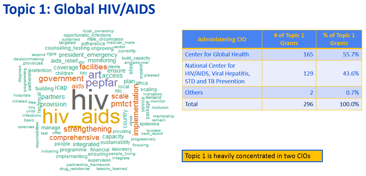
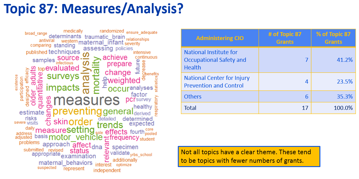
Each of the 100 topics has a distribution of more and less common words in its vocabulary. In the above automatically detected topic, top words are highlighted in the word cloud. He pulls in meta-information on which of the 13 CDC centers funded these grants and is able to assign a meaningful title of Global HIV/AIDS to this cluster.
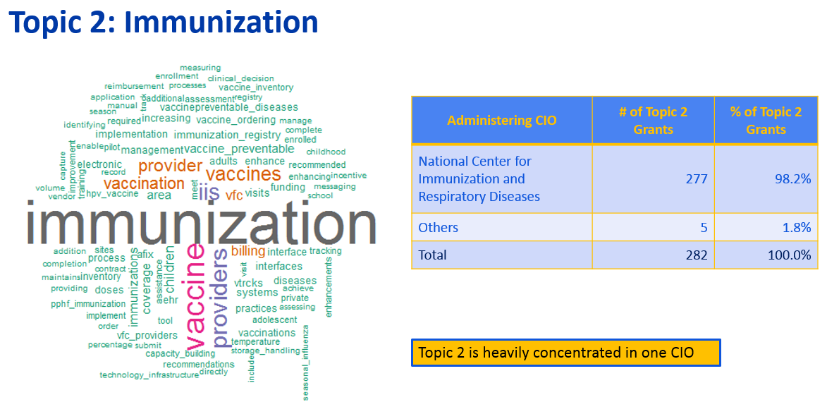
Ranking the topics by number of grants associated with it, number two, above at top he titled Immunization, which funding came from Center of Immunization and Respiratory Diseases.
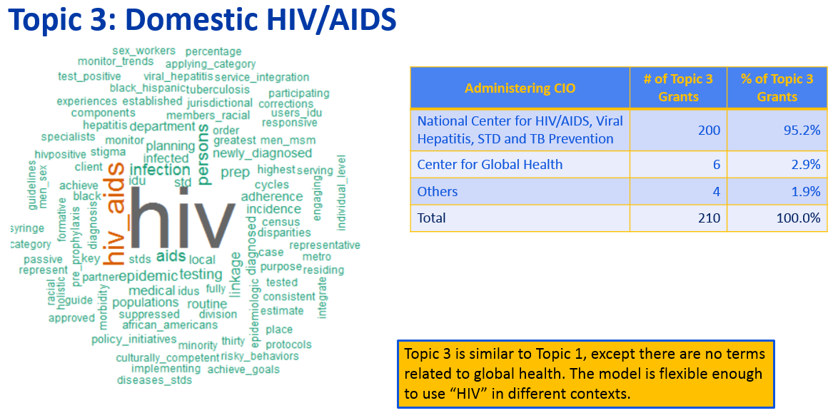
Topic three, interestingly had to do with domestic HIV/AIDS. LDA does a good job here of handling that the token “HIV” can show up in two topics. Can see also, at 2.9% vs. 55.7%, much less funding for this topic came from Center for Global Health.
As an example of less frequently funded topics, number 87 out of 100 doesn’t have a clear vocabulary theme.
Exploratory Data Structure Comparisons by Use of Principal Component Analysis Anne Helby Petersen, Biostatistics, University of Copenhagen
Couldn’t get in the door for this one it was so packed!
Problem: Recently countries have been ranked by happiness, with Denmark being #1 until Norway took over #1 in 2017. But is it really fair to compare countries with potentially different senses of what happiness means? Can we identify where countries differ in their definition of happiness mathematically?
She expresses her question as if a person from Bulgaria (ranked 144) was put in the same situation as a person from Denmark (ranked 2) would they be equally happy? Does the concept of happiness in Bulgaria translate to that of Denmark? She uses 6 variables in a standardized happiness questionnaire, the European Social Survey, takes the covariance matrix among these 6 variables for each country, and applies Principal Components Analysis to asses if data is structured similarly for each country.
To do data structure comparisons using PCA, she uses a self-authored R package PCADSC with three visuals to asses similarity. A cumulative eigenvalue (CE) plot compares “actual dimension” of data, an angle plot identifies components for which datasets differ, and a chroma plot interprets differences in weights. If Denmark and Bulgaria have similar concepts of psychological well-being, one can expect these plots to show similar eigenvalue sizes with lines within shaded areas and large p-values, similar component structures with arrows mostly diagonal and small angles between them, and similar PCA loading patterns visually.
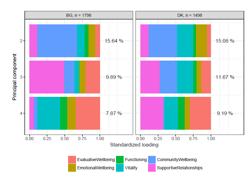
In this case there are big differences in all three plots. Some of the detail of what makes someone happy in the two countries is in the chroma plot of PCA loadings. Can see in the second principal component’s loading among those surveyed, Bulgarians care a lot more about community wellbeing and Danes care relatively more about vitality and emotional wellbeing. In the third principal component, it almost diverges even more as Bulgarians strongly care about supportive relationships while Danes care about that but equally with community and vitality again. Though the first princliple component isn’t shown, and that may be similar, as two european countries, these tell different stories about additional nuances of what happiness means to one set of people or another.
When she compares Norway and Denmark with all three plots, differences are much lower. So even though there are some mathematical issues with ranking happiness of countries, Norway and Denmark are comparable. Thus, for her and her Danish fellow countrymen, there is no way around Norway’s victory over Denmark.
Tools for Exploratory Data Analysis Wendy L. Martinez, U.S. Bureau of Labor Statistics
Problem: what the heck is the structure of your data? Are there any especially useful tools to use to get a handle on the stories in some data?
For dimensionality reduction, everyone hears about Principal Components Analysis (PCA) a linear method. On a podcast someone once described PCA as one of a handful of top-useful algorithms in stats/ML/datascience. Multidimensional Scaling is a set of nonlinear dimensionality reduction techniques. There are two kinds of MDS: Metric, which uses a function of dissimilarities such as Euclidean distance for PCA, and Non-Metric, which instead uses rank-order.
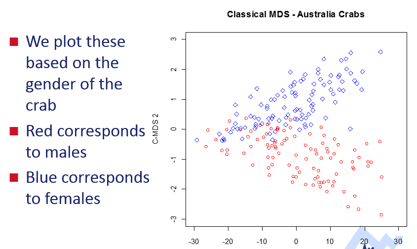
In this example they used MDS on some crab data, and colored according to gender. There does appear to be some clustering similar to these two genders.
She also highly recommends the simple scatterplot with loess.
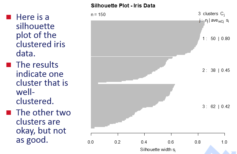
Another common exploratory data analysis method is clustering, such as the famous k-means. A silhouette plot helps show how well clusterings are in terms of internal validation anyway. In this example, there are no negative values which is good, and one cluster looks good but the other two are too close I think:
She recommends animated “data tours” to see data along an additional dimension of time. These rotate scatterplots around different dimensions, and can give a quick sense of structure from several angles. For high dimensional data, since there are many ways to reduce dimensions, these animations can help get a sense of the different reasonable views of data structure. She used MATLAB and looks like there is an R package, tourr to look into on this - may want to use tourrGui.
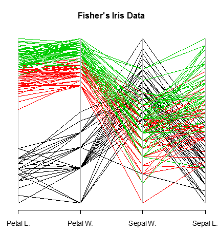
She’s a fan of parallel coordinate plots for finding structure across many dimensions. I suppose it helps to have one categorical factor and the rest be numerical. Have seen these a few times recently, and maybe with alpha = 0.1 could handle larger data sets. These plots can be used in another method of interactive visualization called Brushing and Linking which could be useful for when there are several views or plots of data. For parallel coordinate plots she mentions reordering variables matters since adjacent variables are easier to see differences and color helps with categorical variables. Here a parallel plot handles 5 dimensions of data and shows obvious clustering:
How to Give a Really Awful Presentation Paul Teetor, William Blair & Co
I arrived at the end of this session to attend the next one in the room, and the room was laughing and very engaged.
Problem: statistical presentions are too easily awful. What are the ways they can be awful and ways these can be remedied?
He has a great set of slides to remind the audience in a funny way of basically what to do and what not to do when giving a statistical presentation. Like this one:
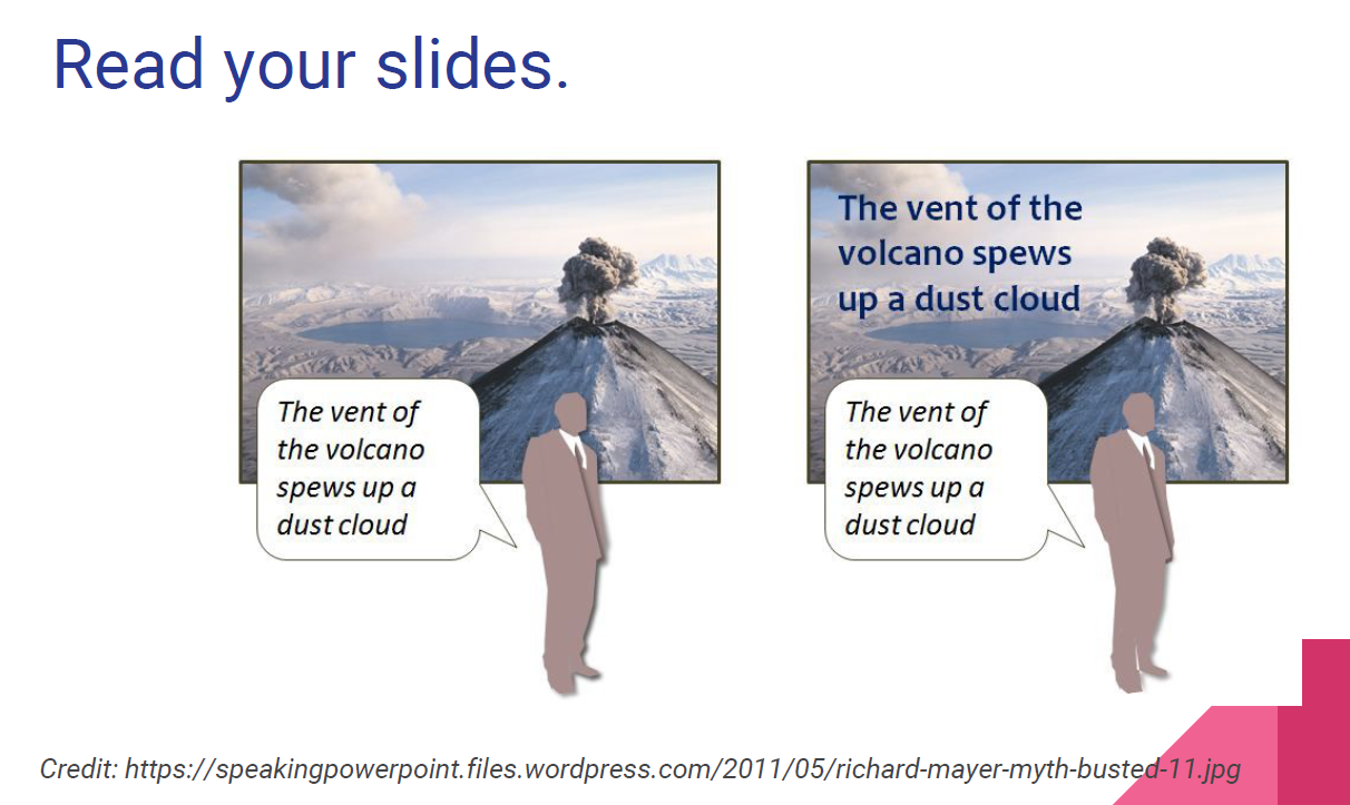
The talk says there are three general places one can make a presentation awful or better:
- Writing the presentation
- Giving the presentation
- The bigger picture
All good reminders for my next important presentation of an analysis so that is is better and not awful!
CANCELED: A Streamlined Process for Conducting a Propensity Score-Based Analysis John A. Craycroft, University of Louisville
Weather canceled the presenters’s flight. Wonder if this presentation is available.
The Life-Cycle of a Project: Visualizing Data from Start to Finish Nola du Toit, NORC at the University of Chicago
Problem: too much data, need to summarize it for quickly digesting meaning.
This presentation seems like basic common sense about data visualization. I don’t see anything that new for me in the slides. I did like this guideline of stepping back and considering your audience and reducing clutter. On the one hand, there is a need to make visualiztions interesting, but on the other, there is a need for them to not be overwhleming. I think every bit of information costs mental energy and focus, and I like the guideline of the UI design book with the title with a perfect summary reporting design mantra, Don’t Make Me Think.
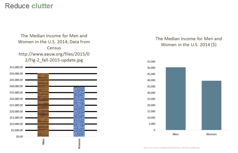
She reccomends a couple other resources that may be worth checking out for visualization: http://www.thefunctionalart.com/ and http://www.nbr-graphs.com/.
I think some of the point in these slides might be that one can visualize more parts of a project’s process than one may think, and they could even be simple visualizations. Doing this for many parts of a project can quickly give a lot of insight into how a project is going.
Warranty/Performance Text Exploration for Modern Reliability Scott Lee Wise, SAS Institute, Inc.
Problem: comments sometimes have valuable information not available in structured data, but as unstructured data they are often ignored in summary analyses. Are there any standard pieplines for getting summarizable information out of unstructured text data?
He has a specific case of exploring text in computer warranty and performance failures data to better model issues with a product’s reliability. In his case, this unstructured information is critical and greatly improves modelling performance. He starts with failure data like this and aims to end up with meaningful stories about where the most commonly reported issues are.
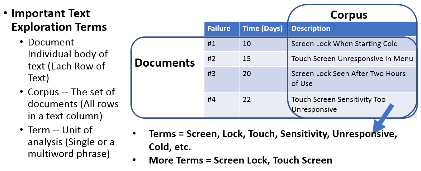
The basic steps of his pipeline are:
- Summarizing – Find out the words that occur the most often in your text data
- Preparing – Fine tune the list of biggest terms and phrases in your text data
- Visualizing – Graphically see largest terms in your text data
- Analyzing – Dimensionally reduce down to most important terms and topics
- Modeling – Incorporate learnings into Better Reliability and Predictive Models
He uses SAS JMP Pro Statistical Discovery Software to do this.
In step 1, summarizing, he parses text into tokens using built-in libraries and stems to remove suffixes.
In step 2, preparing, he removes stop words, sorts terms by count and also any high-count n-grams phrases, and removes cases of bigrams that are parts of highly common trigrams.
In step 3, visualizing, he uses a word cloud with color gradient by fequency or another factor like severity, and is able to drill down to different levels of summarization to figure out what the big issues are.
Step 4, analyzing, he just does the indicator column for desired terms and n-grams/phrases, to get to a document term matrix, and clusters using latent symantic anayslsis with singular value decomposition. This outputs a scatterplot matrix that shows differences among documents and terms, allowing drilldown. Basically it outputs the big topics in the corpora. In his case this showed a common issue with terms a somain expert would associate with Bios failures.
Step 5, modelling, he adds a binary variable of whether a warranty claim has to do with Bios, identified a Frechet distribution to the probability of time to failure. He build binary indicator variables for all of the top ten terms (though not categories from step 4 it seems) and is able to build a predictive model of severity of issue using ordinal logisitc regression.
In the end, this allows for better modelling of why the computers that failed, did. One could imagine for their warranty data set, looking at claims after changes are implemented would give a sense of what is the new biggest issue to resolve to prioritize.
Evaluating Model Fit for Predictive Validity Katherine M. Wright, Northwestern University
Not posted online yet.
up next: 9:15 AM Poster Session 3 / Survival Analysis v. ‘Survival’ Analysis